THE CLEVELAND MUSEUM OF ART
THE CLEVELAND MUSEUM OF ART
THE CLEVELAND MUSEUM OF ART
THE CLEVELAND MUSEUM OF ART
THE CLEVELAND MUSEUM OF ART
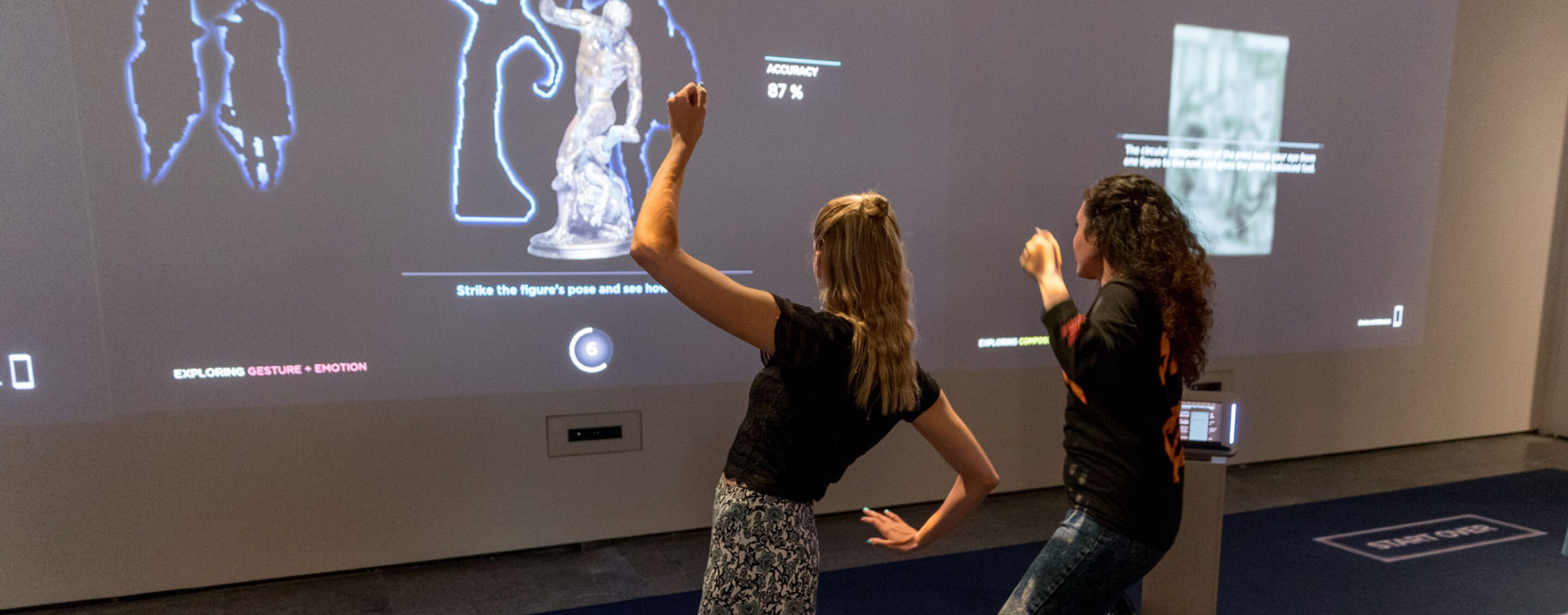
The Artlens Exhibit placing visitors in conversation with works of art
The Artlens Exhibit placing visitors in conversation with works of art
The Artlens Exhibit placing visitors in conversation with works of art
The Artlens Exhibit placing visitors in conversation with works of art
The Artlens Exhibit placing visitors in conversation with works of art
ROLE
UI/UX Design
ROLE
UX Design
ROLE
UX Design
ROLE
UX Design
AGENCY
Potion
AGENCY
Potion
AGENCY
Potion
AGENCY
Potion
AGENCY
Potion
TIMELINE
July 2016 – July 2017
TIMELINE
July 2016 – July 2017
TIMELINE
July 2016 – July 2017
TIMELINE
July 2016 – July 2017
TEAM
PHILLIP TIONGSON Principal
STEVE VARGA Technology Director
MATTHEW MCNERNEY Design Director
RHEA LAROYA/EDYTA LEWICKA Interactive designers
RUTH CHUNG/XIAOYIN SUN Designers
CAMERON BROWNING S.Creative Technologist
FILLIPO VANUCCI S.Creative Technologist
LUOBIN WANG/RITESH LALA Creative Technologists
CLAIRE BRADLEY/DREW RADTKE Associate producers
AWARDS
Communication Arts Award of Excellence
Apex Awards Silver
Museums and the Web Winner: Groundbreaking
Media Technology Muse Awards Silver
Ohio Technology Awards Finalist
Fast Company Innovation by Design Honorable Mention
AWARDS
Communication Arts Award of Excellence
Apex Awards Silver
Museums and the Web Winner: Groundbreaking
Media Technology Muse Awards Silver
Ohio Technology Awards Finalist
Fast Company Innovation by Design Honorable Mention
AWARDS
Communication Arts Award of Excellence
Apex Awards Silver
Museums and the Web Winner: Groundbreaking
Media Technology Muse Awards Silver
Ohio Technology Awards Finalist
Fast Company Innovation by Design Honorable Mention
AWARDS
Communication Arts Award of Excellence
Apex Awards Silver
Museums and the Web Winner: Groundbreaking
Media Technology Muse Awards Silver
Ohio Technology Awards Finalist
Fast Company Innovation by Design Honorable Mention
OVERVIEW
OVERVIEW
OVERVIEW
OVERVIEW
OVERVIEW
The Cleveland Museum of Art's digital gallery, while fun and exciting, didn't fulfill the museums larger mission of educating visitors. How do you reinvent an interactive to engage visitors in new ways of understanding art?
The Cleveland Museum of art is at the forefront of creating engaging and innovative educational interactives. The previous interactive experience at the museum, Gallery One, included 6 screen-based interactives. Visitors had trouble applying the concepts they learnt from the screen experience to the real, physical art. Only a small percentage of visitors actually wanted to go and seek out the art they played with. Repeat visitors were not rewarded with new artworks, and had to play with the same artworks again. Also despite the fact that 90% of the visitors come in groups, the experience did not accommodate shared interaction. The interactive felt more like a kit of parts than a holistic experience. Potion was tasked with bringing the focus back to the art and enhancing visitor learning
The Cleveland Museum of Art's digital gallery, while fun and exciting, didn't fulfill the museums larger mission of educating visitors. How do you reinvent an interactive to engage visitors in new ways of understanding art?
The Cleveland Museum of art is at the forefront of creating engaging and innovative educational interactives. The previous interactive experience at the museum, Gallery One, included 6 screen-based interactives. Visitors had trouble applying the concepts they learnt from the screen experience to the real, physical art. Only a small percentage of visitors actually wanted to go and seek out the art they played with. Also despite the fact that 90% of the visitors come in groups, the experience did not accommodate shared interaction. The interactive felt more like a kit of parts than a holistic experience. Potion was tasked with bringing the focus back to the art and enhancing visitor learning
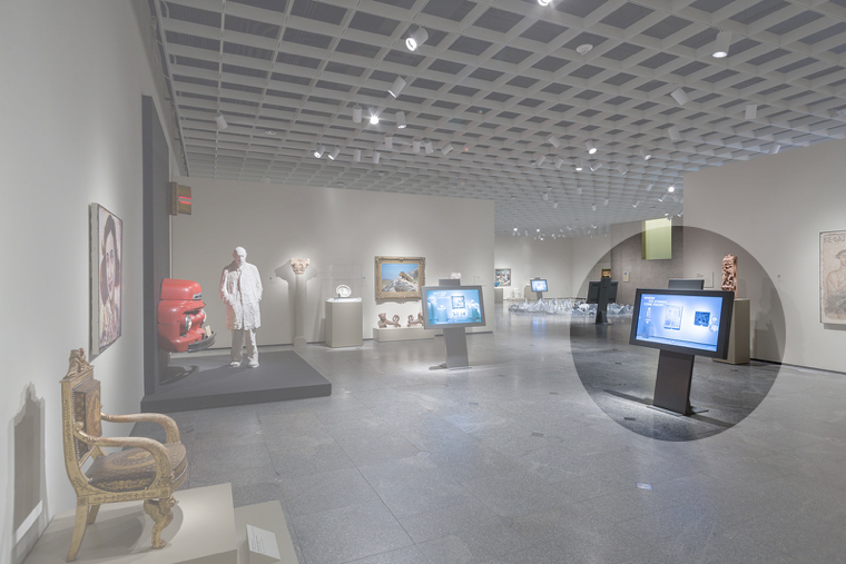
Touchscreens in the original gallery blocked visitors from connecting the digital art to the real artworks. Visitors weren't applying what they learnt to the rest of the museum.
Touchscreens in the original gallery blocked visitors from connecting the digital art to the real artworks. Visitors weren't applying what they learnt to the rest of the museum.
Touchscreens in the original gallery blocked visitors from connecting the digital art to the real artworks. Visitors weren't applying what they learnt to the rest of the museum.
Screens block visitors from connecting to the art in the old design
Screens block visitors from connecting to the art in the old design
THE SOLUTION
We created a mixed reality, gesture sensing experience that mirrors visitors to give them the tools to learn about foundational art concepts.
THE SOLUTION
We created a mixed reality, gesture sensing experience that mirrors visitors to give them the tools to learn about foundational art concepts.
THE SOLUTION
We created a mixed reality, gesture sensing experience that mirrors visitors to give them the tools to learn about foundational art concepts.
THE SOLUTION
We created a mixed reality, gesture sensing experience that mirrors visitors to give them the tools to learn about foundational art concepts.
THE SOLUTION
We created a mixed reality, gesture sensing experience that mirrors visitors to give them the tools to learn about foundational art concepts.
16
Games
6
Microsoft Kinects
14ft
Tall projections
1000
Artworks
Courtesy The Cleveland Museum of Art
Produced by Grant Davis
Produced by Grant Davis
Produced by Grant Davis
Produced by Grant Davis
MY ROLE
MY ROLE
MY ROLE
MY ROLE
MY ROLE
As part of this project for a year I helped concept ideas, defined the core interactions of the games, refined designs based on usability tests and took charge of communications with the development team.
The scope of this project was massive and involved a collaborative effort between digital designers, developers, curators, exhibition designers, and museum educators. My daily responsibilities included ideation, creating user flows and wireframes, designing motion studies as proofs of concept, refining designs based on usability results, and handing off design specifications to the development team. My role significantly increased once our design team was whittled down to two when the lead designer left, and I honed the final design alongside the creative director.
As part of this project for a year I helped concept ideas, defined the core interactions of the games, refined designs based on usability tests and took charge of communications with the development team.
As part of this project for a year I helped concept ideas, defined the core interactions of the games, refined designs based on usability tests and took charge of communications with the development team.
The scope of this project was massive and involved a collaborative effort between digital designers, developers, curators, exhibition designers, and museum educators. My daily responsibilities included ideation, creating user flows and wireframes, designing motion studies as proofs of concept, refining designs based on usability results, and handing off design specifications to the development team. My role significantly increased once our design team was whittled down to two when the lead designer left, and I honed the final design alongside the creative director.
The scope of this project was massive and involved a collaborative effort between digital designers, developers, curators, exhibition designers, and museum educators. My daily responsibilities included ideation, creating user flows and wireframes, designing motion studies as proofs of concept, refining designs based on usability results, and handing off design specifications to the development team. My role significantly increased once our design team was whittled down to two when the lead designer left, and I honed the final design alongside the creative director.
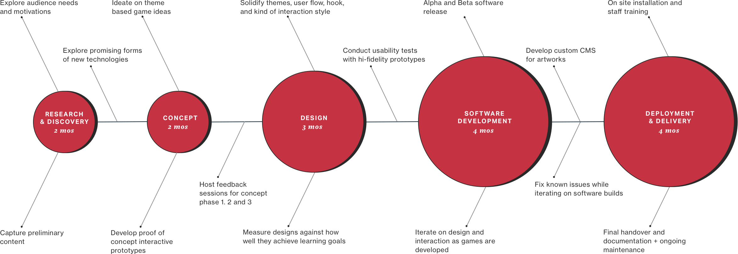
PROJECT ROADMAP [15 months]
PROJECT ROADMAP [15 months]
PROJECT ROADMAP [15 months]
PROJECT ROADMAP [15 months]
PROJECT ROADMAP [15 months]
From research & discovery to deployment
From research & discovery to deployment
From research & discovery to deployment
From research & discovery to deployment
From foundational discovery to proof-of-concept prototype
PROJECT GOALS
PROJECT GOALS
PROJECT GOALS
PROJECT GOALS
PROJECT GOALS
Designing the 16 games around 5 simple tenets
Designing the 16 games around 5 simple tenets
Designing the 16 games around 5 simple tenets
Designing the 16 games around 5 simple tenets
Designing the 16 games around 5 simple tenets
ART AT THE FOREFRONT
Make sure that the digital experience does not compete with the wonder of experiencing the real art. Art should be at the forefront, not technology.
ART AT THE FOREFRONT
Make sure that the digital experience does not compete with the wonder of experiencing the real art. Art should be at the forefront, not technology.
Make sure that the digital experience does not compete with the wonder of experiencing the real art. Art should be at the forefront, not technology.
Make sure that the digital experience does not compete with the wonder of experiencing the real art. Art should be at the forefront, not technology.
APPLIED LEARNING
While visitors enjoy the playful elements, they should be able connect to what they learn to other parts of the exhibit
APPLIED LEARNING
While visitors enjoy the playful elements, they should be able connect to what they learn to other parts of the exhibit
APPLIED LEARNING
While visitors enjoy the playful elements, they should be able connect to what they learn to other parts of the exhibit
Encourage visitors to use what they have learnt from the interactives while exploring the rest of the museums galleries.
Encourage visitors to use what they have learnt from the interactives while exploring the rest of the museums galleries.
CONNECT TO PHYSICAL ART
Make a more obvious connection between the interactive artworks and the physical artworks on view in the gallery.
CONNECT TO PHYSICAL ART
Make a more obvious connection between the interactive artworks and the physical artworks on view in the gallery.
CONNECT PHYSICAL ART
Make a more obvious connection between the interactive artworks and the physical artworks on view in the gallery.
Make a more obvious connection between the interactive artworks and the physical artworks on view in the gallery.
Make a more obvious connection between the interactive artworks and the physical artworks on view in the gallery.
PERSONALIZED EXPERIENCE
Give visitors a personal connection to the museum by integrating the experience with the ARTLENS app.
PERSONALIZED EXPERIENCE
Give visitors a personal connection to the museum by integrating the experience with the ARTLENS app.
PERSONALIZED EXPERIENCE
Give visitors a personal connection to the museum by integrating the experience with the ARTLENS app.
Give visitors a personal connection to the museum by integrating the experience with the ARTLENS app.
Give visitors a personal connection to the museum by integrating the experience with the ARTLENS app.
PUBLIC VS. PRIVATE
Certain experiences warrant time for exploration and personal space away from spectators.
PUBLIC VS. PRIVATE
Certain experiences warrant time for exploration and personal space away from spectators.
PUBLIC VS. PRIVATE
Certain experiences warrant time for exploration and personal space away from spectators.
Certain experiences warrant time for exploration and personal space away from spectators.
Certain experiences warrant time for exploration and personal space away from spectators.
UNDERSTANDING THE AUDIENCE
UNDERSTANDING THE AUDIENCE
UNDERSTANDING THE AUDIENCE
UNDERSTANDING THE AUDIENCE
UNDERSTANDING THE AUDIENCE
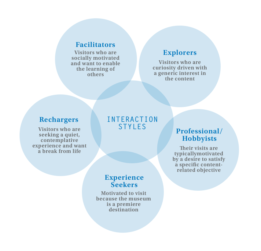
CMA gets a diverse range of visitors with varying kinds of motivations for visiting. The ArtLens Gallery is primarily meant for visitors who are new to art to give them skills they can take to the rest of the museum.
CMA gets a diverse range of visitors with varying kinds of motivations for visiting. The ArtLens Gallery is primarily meant for visitors who are new to art to give them skills they can take to the rest of the museum.
CMA gets a diverse range of visitors with varying kinds of motivations for visiting. The ArtLens Gallery is primarily meant for visitors who are new to art to give them skills they can take to the rest of the museum.
CMA gets a diverse range of visitors with varying kinds of motivations for visiting. The ArtLens Gallery is primarily meant for visitors who are new to art to give them skills they can take to the rest of the museum.
CMA gets a diverse range of visitors with varying kinds of motivations for visiting. The ArtLens Gallery is primarily meant for visitors who are new to art to give them skills they can take to the rest of the museum.
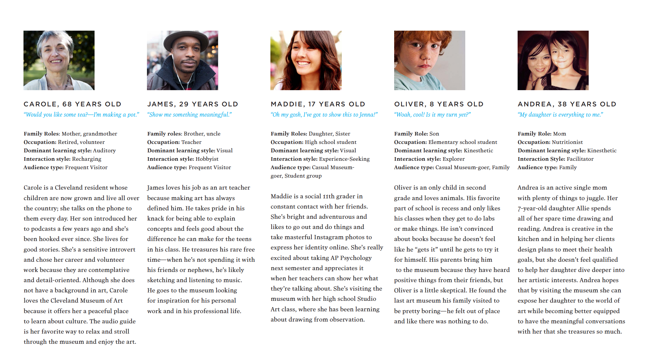
[L to R] Taken from 'Understanding Museum Visitor's Motivations and Learning' by John Falk, Visitor archetypes
EDUCATIONAL FRAMEWORK
EDUCATIONAL FRAMEWORK
Each game explores one of four themes that help a visitor investigate the art piece from multiple angles.
Each game explores one of four themes that help a visitor investigate the art piece from multiple angles.
Each game explores one of four themes that help a visitor investigate the art piece from multiple angles.
Each game explores one of four themes that help a visitor investigate the art piece from multiple angles.
Each game explores one of four themes that help a visitor investigate the art piece from multiple angles.
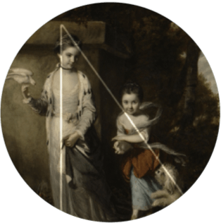
Composition
Composition
Composition
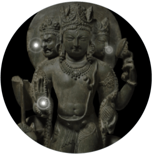
Symbols
Symbols
Symbols
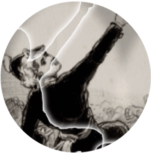
Gesture
Gesture
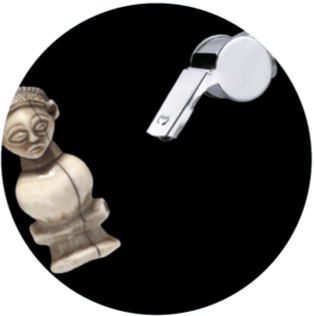
Purpose
Purpose
CREATING FLOWS
CREATING FLOWS
CREATING FLOW
CREATING FLOWS
CREATING USER FLOWS
Turning static user flows into animated stories
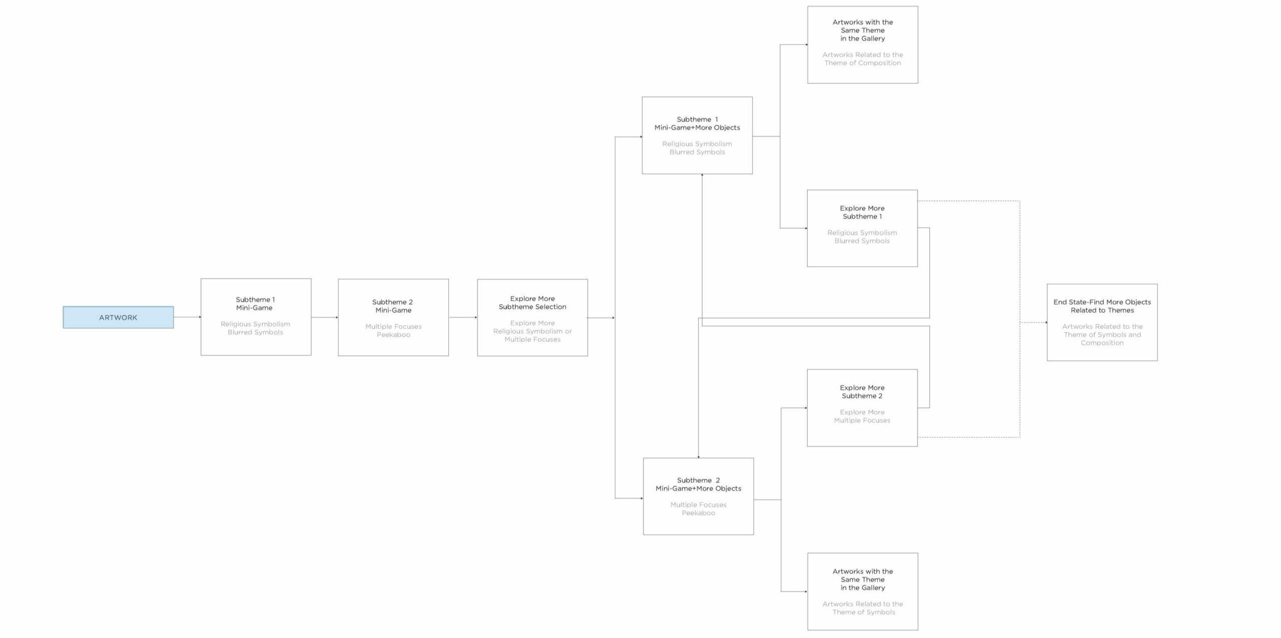
I created animated user flows in AfterEffects to describe the overarching user flow of the entire experience and each individual game. Animating the interactions that take place help the team and the client to visualize how the details (the interface elements) and the actions (the game mechanics) come together. They also provide the material needed to understand whether the games are achieving the museums learning goals. The following flow describes the overall interaction a visitor would have from when they approach a projection through to gameplay based on the art object they choose to play with.
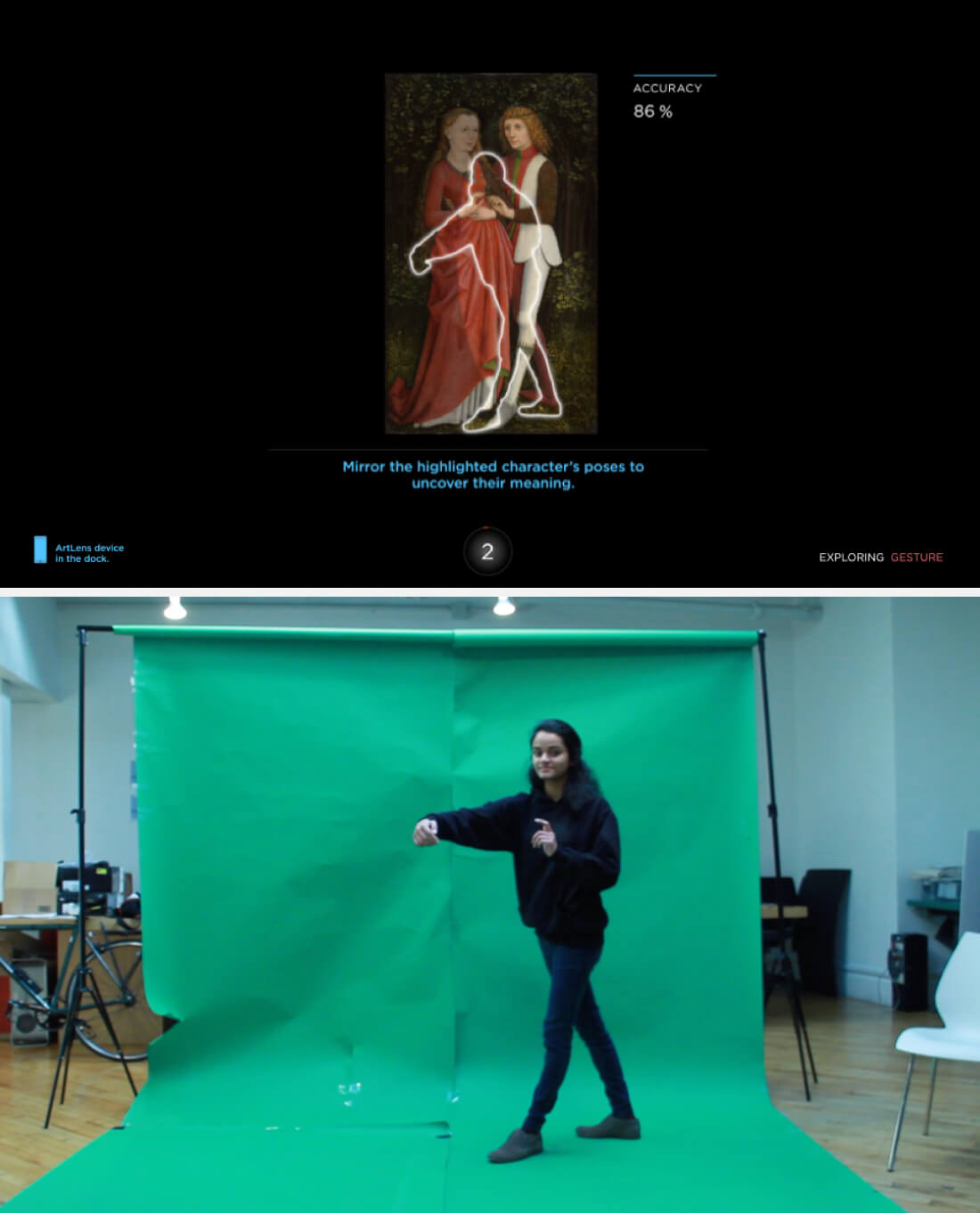
A green screen proved very handy in making the animations
A green screen proved very handy in making the animations
DESIGNING FOR GESTURE
DESIGNING FOR GESTURE
DESIGNING FOR GESTURE
DESIGNING FOR GESTURE
DESIGNING FOR GESTURE
Using Microsoft Kinect’s Human Interface Guidelines to develop gestural interactions that feel natural
Gestural interaction is still uncharted territory for most users. In designing the games, we picked gestures that the user can easily perform, that feel natural, that provide immediate feedback and keep the users cognitive load low. Similar tasks also use the same gestural language.
The primary selection gesture we used is grab and drop because of its similiarity to real world mechanics. When this action was tested amongst participants. I found that it was far more effective to use a figurative hand than an abstract shape as a visual cursor. I also discovered that call outs to grab helped to onboard the visitor to the action, and displayed the call outs when the user remained inactive for a certain amount of time.
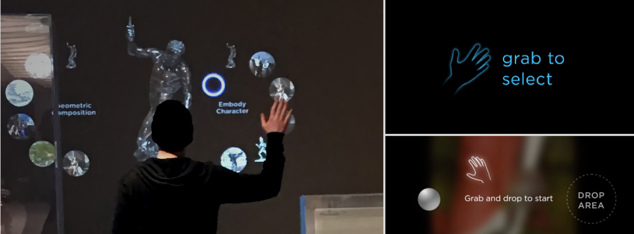
[L to R] Testing the grab and drop gesture with a circular cursor, studying degrees of onboarding the interaction
In the game Multiple Focuses, the player needed to use their hands as a magnifiying glass and find a point of interest in the artwork using a gesture. The snapshot gesture to the left proved to be fatiguing and we replaced it with a simple hover gesture. Prototype tests showed us that people were likely to switch between hands while playing the game, so we included that ability as well.
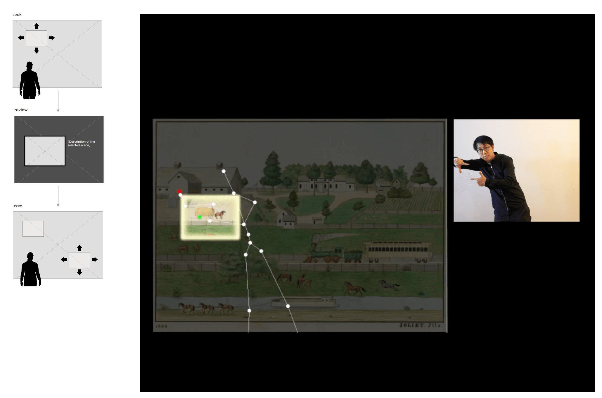
This gesture provide difficult to keep for long periods
Just hovering your hand was far easier
DESIGNING FOR GESTURE
Visitors have no actual physical contact with the interface, and visual feedback became tantamount to designing a smooth experience.
The feedback design follows the primary tenet of our visual strategy- to minimize the interface and let the art breathe. In this example, I’ve separated the interface of the game Symbol Sleuth into its many states.
WORKING WITH THE KINECT
A universal layout helps acclimatize visitors to interactable areas, and is a workaround to the Kinect’s limited range of detection
Designing a universal layout not only made the developers lives alot easier but also tackled the tecnological limitations of the Kinect . After user testing an early prototype of the grab and drop interaction, we found that selectable elements had to be placed above hip height, because of the users range of motion and the Kinects range of detection.
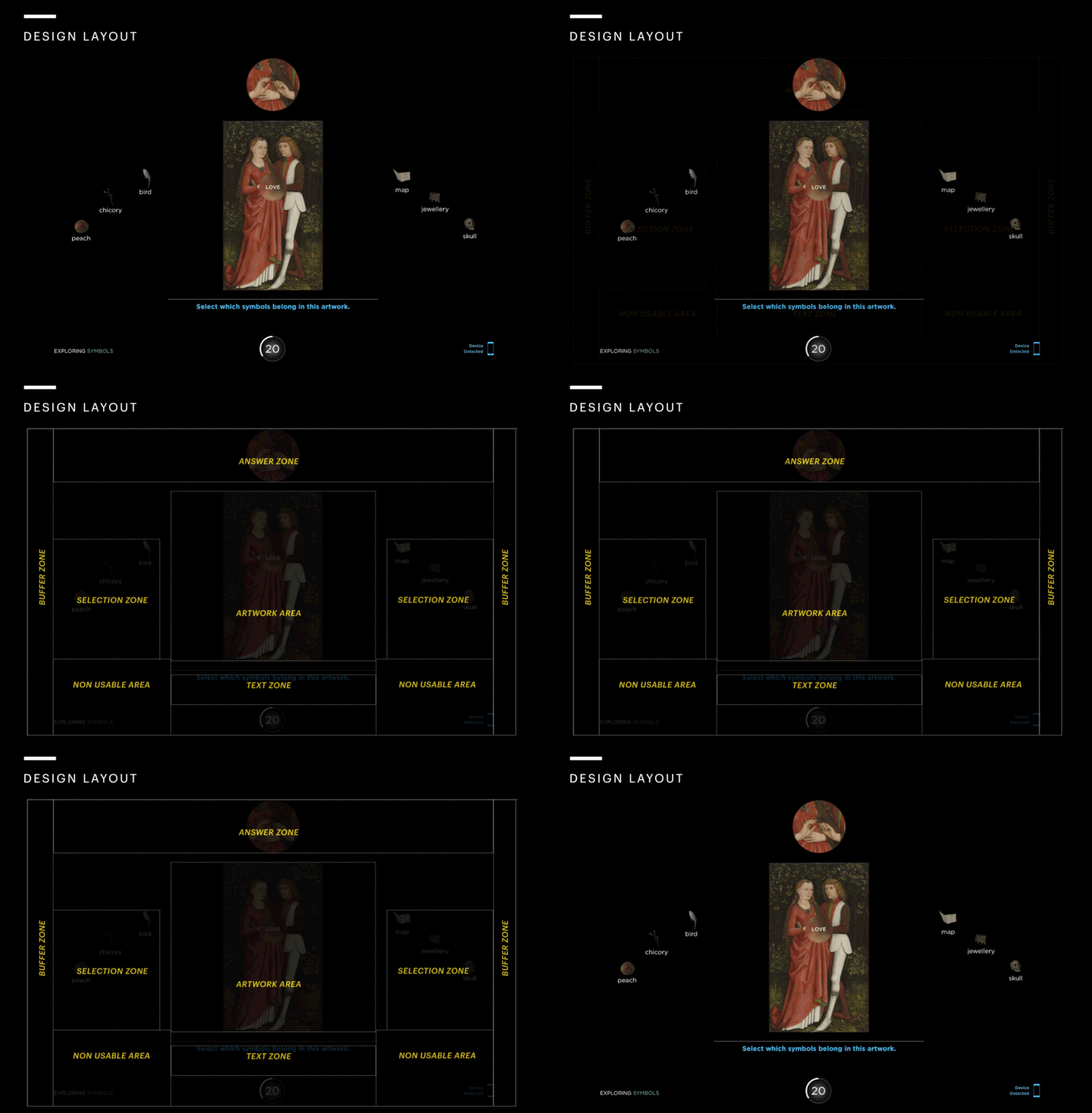
GAME: EMBODY CHARACTER
GAME THEME:GESTURE
GAME THEME:GESTURE
GAME THEME:GESTURE
GAME THEME:GESTURE
Designing the game, Embody Character
Learning Goal: In contextual emotion, meaning comes from the setting and interaction between figures.
In the game Embody Character, visitors are prompted to mirror the pose of a character in an artwork. By mimicking the pose, visitors reveal how the characters gestures contribute to the meaning or story of the artwork. When designing the games we had to make sure we paid attention to the learning goals of the museum, while also keeping the game fun.
Testing the Strike a Pose game
Testing the Strike a Pose game
Testing the Strike a Pose game
Testing the Strike a Pose game
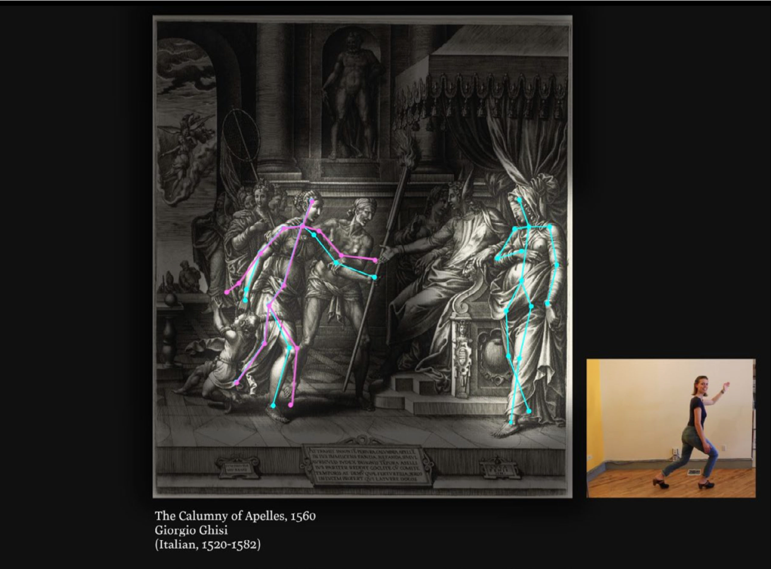
An early prototype of the Embody Character game
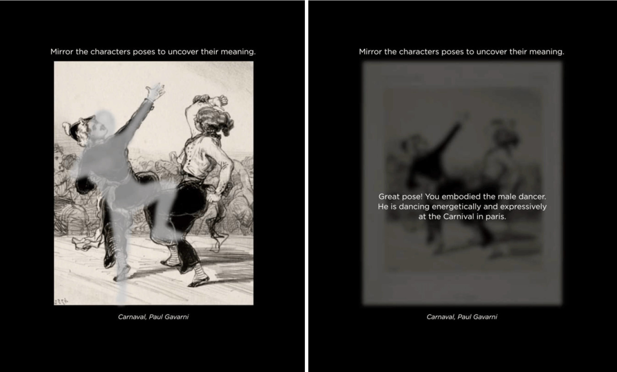
A version of the game with more ui elements, and a shaded figure
USABILITY TESTING
Studying participant behaviour and feedback helped us unearth usability problems that were hindering gameplay.
USABILITY TESTING
Studying participant behaviour and feedback helped us unearth usability problems that were hindering gameplay.
USABILITY TESTING
Studying participant behaviour and feedback helped us unearth usability problems that were hindering gameplay.
USABILITY TESTING
Studying participant behaviour and feedback helped us unearth usability problems that were hindering gameplay.
USABILITY TESTING
Studying participant behaviour and feedback helped us unearth usability problems that were hindering gameplay.
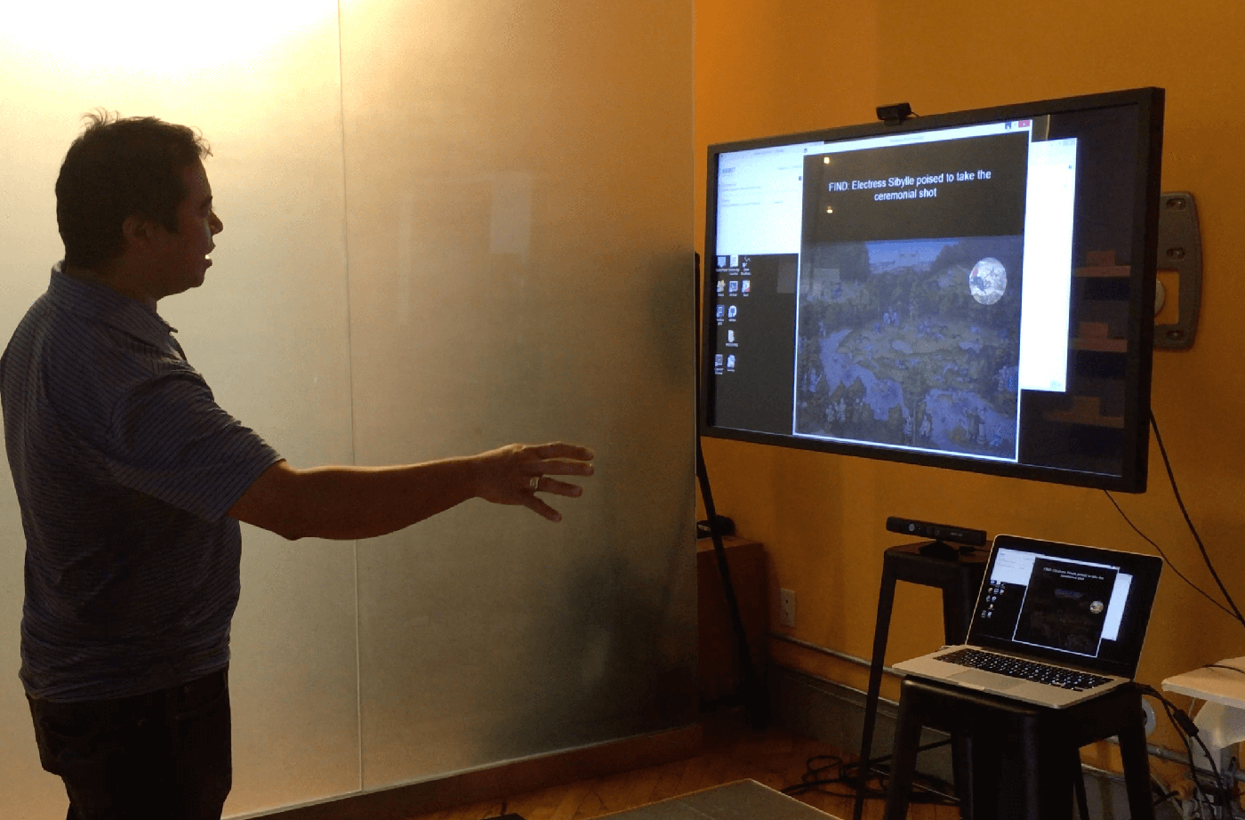
Testing Embody Character at the Museum
Testing the Strike a Pose game
Testing the Strike a Pose game
Testing the Strike a Pose game
Testing the Strike a Pose game
96 Participants
96 Participants
96 Participants
96 Participants
96 Participants
Kinect Prototype
Kinect Prototype
Kinect Prototype
Kinect Prototype
Kinect Prototype
2 Weeks
2 Weeks
2 Weeks
2 Weeks
2 Weeks
Usability Testing
Usability Testing
Usability Testing
Usability Testing
Usability Testing
Members of the public from CMA’s target audience groups were invited to CMA to play with an early stage prototype of Embody Character to evaluate if they understood the game mechanics and learning outcomes. While the overwhelming response from visitors was that the game was fun, there were a number of interface opportunities which we had missed including in the feedback design and success messaging. On average, visitors played through two objects with this game.
In the game Strike a Pose, visitors are prompted to mirror the pose of a character in an artwork. By mimicking the pose, visitors reveal how the characters gestures contribute to the meaning or story of the artwork. Members of the public from CMA’s target audience groups were invited to CMA to play with an early stage prototype of Strike a Pose to evaluate if they understood the game mechanics and learning outcomes. While the overwhelming response from visitors was that the game was fun, there were a number of interface opportunities which we had missed including in the feedback design and success messaging.
In the game Strike a Pose, visitors are prompted to mirror the pose of a character in an artwork. By mimicking the pose, visitors reveal how the characters gestures contribute to the meaning or story of the artwork. Members of the public from CMA’s target audience groups were invited to CMA to play with an early stage prototype of Strike a Pose to evaluate if they understood the game mechanics and learning outcomes. While the overwhelming response from visitors was that the game was fun, there were a number of interface opportunities which we had missed including in the feedback design and success messaging.
In the game Strike a Pose, visitors are prompted to mirror the pose of a character in an artwork. By mimicking the pose, visitors reveal how the characters gestures contribute to the meaning or story of the artwork. Members of the public from CMA’s target audience groups were invited to CMA to play with an early stage prototype of Strike a Pose to evaluate if they understood the game mechanics and learning outcomes. While the overwhelming response from visitors was that the game was fun, there were a number of interface opportunities which we had missed including in the feedback design and success messaging.
In the game Strike a Pose, visitors are prompted to mirror the pose of a character in an artwork. By mimicking the pose, visitors reveal how the characters gestures contribute to the meaning or story of the artwork. Members of the public from CMA’s target audience groups were invited to CMA to play with an early stage prototype of Strike a Pose to evaluate if they understood the game mechanics and learning outcomes. While the overwhelming response from visitors was that the game was fun, there were a number of interface opportunities which we had missed including in the feedback design and success messaging.
SAMPLE
96 participants/36 Groups
26 non-member groups and 12 member groups
18 groups had at least one member who had used a Kinect
SAMPLE
96 participants/36 Groups
26 non-member groups and 12 member groups
18 groups had at least one member who had used a Kinect
SAMPLE
96 participants/36 Groups
26 non-member groups and 12 member groups
18 groups had at least one member who had used a Kinect
SAMPLE
96 participants/36 Groups
26 non-member groups and 12 member groups
18 groups had at least one member who had used a Kinect
SAMPLE
96 participants/36 Groups
26 non-member groups and 12 member groups
18 groups had at least one member who had used a Kinect
Mapping out the opportunities from the prototype results
POSITIVE FEEDBACK
- Visitors do intuitively understand that they need to mirror the pose of the character by moving forwards and backwards to match the correct figure size.
- People are comfortable making less-than-simple poses, including reclining figures and animated action poses
- Visitors ovewhelmingly said the game was fun!
- Visitors wanted to go out and seek the objects played with
INTERFACE OPPORTUNITIES
- Visitors were confused whether it was a single or multiplayer experience.
- Visitors aren’t able to see the pose to be matched because their shaded figure blocks the pose.
- Visitors do not always know how to correct their pose, or how long it will take for game to finish.
- It took to much time to match poses, and people became fatigued.
CONTENT DEVELOPMENT
Once visitors get the right pose or shape, they don’t linger to read the content about the artwork. Possible solution- move the content to the front of the game.
If visitors have been playing a long time, “Great Pose!” messaging is confusing.
Possible solution: Create 2-3 different types of solutions depending on the level of success visitor achieved. For example, “Try again”, or “Try a new artwork.”
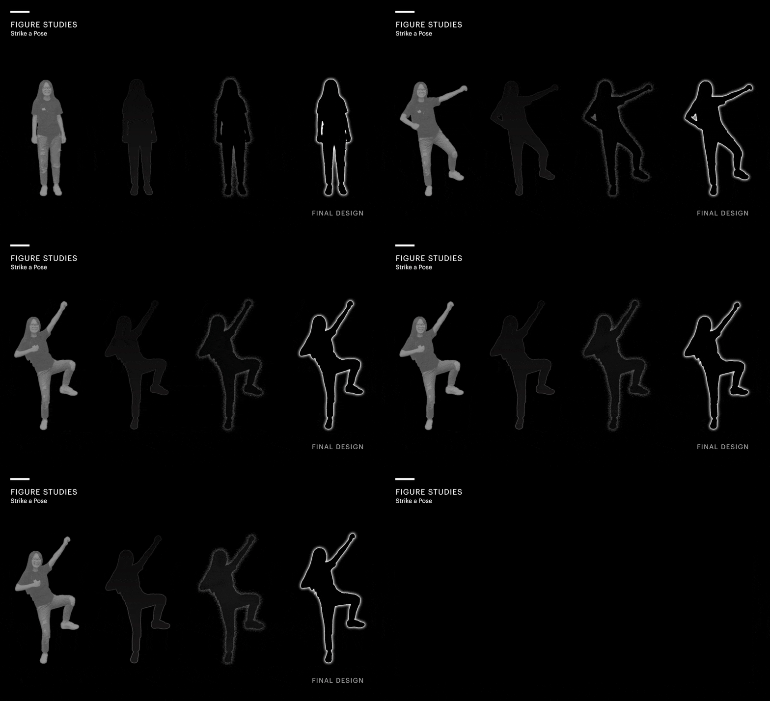
Studying how to make the outlined figure as transparent as possible while still giving adequate feedback to the visitor.
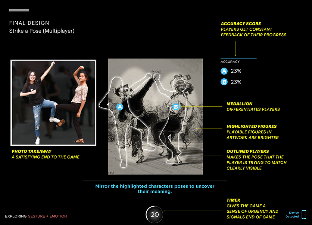
Redesigning the game based on the testing results
IN-DEPTH GAME
IN-DEPTH GAME
IN-DEPTH GAME
IN-DEPTH GAME
IN-DEPTH GAME
Understanding the purpose of objects with Now and Then
Learning Goal: The aesthetics of an object can provide clues to that objects purpose
I came up with idea for this game while looking at Egyptian artefacts in a museum. The artefacts looked nothing like the objects we use today, but were used for similar purposes. In this game, visitors are asked to match an art object with its closest modern equivalent, to teach visitors about the relationship between form and function. As with other games, I started ideating by designing layouts with low-fidelity wireframes. Each layout is based on a particular interaction style.
Understanding the purpose of objects with Now and Then
I came up with idea for this game while looking at Egyptian artefacts in a museum. The artefacts looked nothing like the objects we use today, but were used for similar purposes. In this game, visitors are asked to match an art object with its closest modern equivalent, to teach visitors about the relationship between form and function.
As with other games, I started ideating by designing layouts with low-fidelity wireframes. Each layout is based on a particular interaction style.
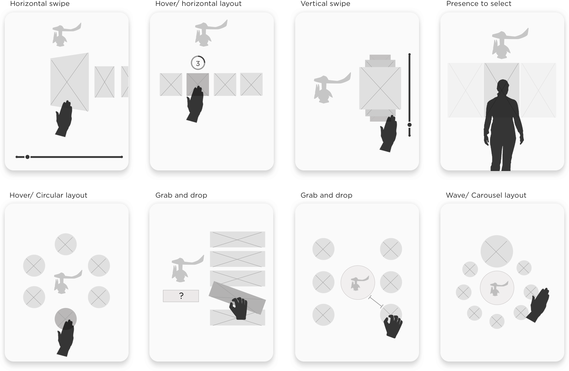
I then developed hi-fidelity motion studies as proofs of concept. In the final game visitors have to grab and drop an answer into a drop zone, getting hints every time the answer is incorrect.
I then developed hi-fidelity motion studies as proofs of concept. In the final game visitors have to grab and drop an answer into a drop zone, getting hints every time the answer is incorrect.
I then developed hi-fidelity motion studies as proofs of concept. In the final game visitors have to grab and drop an answer into a drop zone, getting hints every time the answer is incorrect.
I then developed hi-fidelity motion studies as proofs of concept. In the final game visitors have to grab and drop an answer into a drop zone, getting hints every time the answer is incorrect.
I then developed hi-fidelity motion studies as proofs of concept. In the final game visitors have to grab and drop an answer into a drop zone, getting hints every time the answer is incorrect.
PROJECT IMPACT
PROJECT IMPACT
PROJECT IMPACT
PROJECT IMPACT
PROJECT IMPACT
The museum has described the exhibit as an unprecedented design of an interactive gallery that integrates technology with art
The museum has described the exhibit as an unprecedented design of an interactive gallery that integrates technology with art
The museum has described the exhibit as an unprecedented design of an interactive gallery that integrates technology with art
TThe museum has described the exhibit as an unprecedented design of an interactive gallery that integrates technology with art
The museum has described the exhibit as an unprecedented design of an interactive gallery that integrates technology with art
In preliminary evaluations of the ARTLENS Exhibition, visitors are motivated to use what they have learned and have a greater desire to experience the real physical artworks throughout the museum. The museum describes the exhibit as an "an unparalleled interactive experience, with technology and software that have never been used before in any venue, content interpreted in fun and approachable ways, and an unprecedented design of an interactive gallery space that integrates technology into an art gallery setting."
feel more comfortable looking at art
15 Participants
reported looking closer at art
Android Prototype
want to see the art in person
want to see the art in person
want to see the art in person
want to see the art in person
objects played per user
objects played per user
objects played per user
of play per visitor
of play per visitor
of play per visitor
In preliminary evaluations of the ARTLENS Exhibition, visitors are motivated to use what they have learned and have a greater desire to experience the real physical artworks throughout the museum. The museum describes the exhibit as an "an unparalleled interactive experience, with technology and software that have never been used before in any venue, content interpreted in fun and approachable ways, and an unprecedented design of an interactive gallery space that integrates technology into an art gallery setting."
Findings from the Office of Research and Evaluation, CMA on a random sample of 100 participants
Interested in working together? get in touch.

