THE GEORGIA AQUARIUM
Café Aquaria app reinventing the customer ordering experience
Café Aquaria app reinventing the customer ordering experience
Café Aquaria app reinventing the customer ordering experience
Café Aquaria App reinventing the customer ordering experience
Café Aquaria App reinventing the customer ordering experience
ROLE
UX Design & Research
ROLE
UX Design & Research
ROLE
UX Design & Research
ROLE
UX Design & Research
ORGANISATION
Georgia Tech
ORGANISATION
Georgia Tech
ORGANISATION
Georgia Tech
ORGANISATION
Georgia Tech
ORGANISATION
Georgia Tech
TIMELINE
Aug – Dec 2019
TIMELINE
Aug – Dec 2019
TIMELINE
Aug – Dec 2019
TIMELINE
Aug – Dec 2019
THE PROBLEM
THE PROBLEM
THE PROBLEM
THE PROBLEM
THE PROBLEM
How do you tackle overcrowding at the main eatery of one of the most visited Aquariums in America?
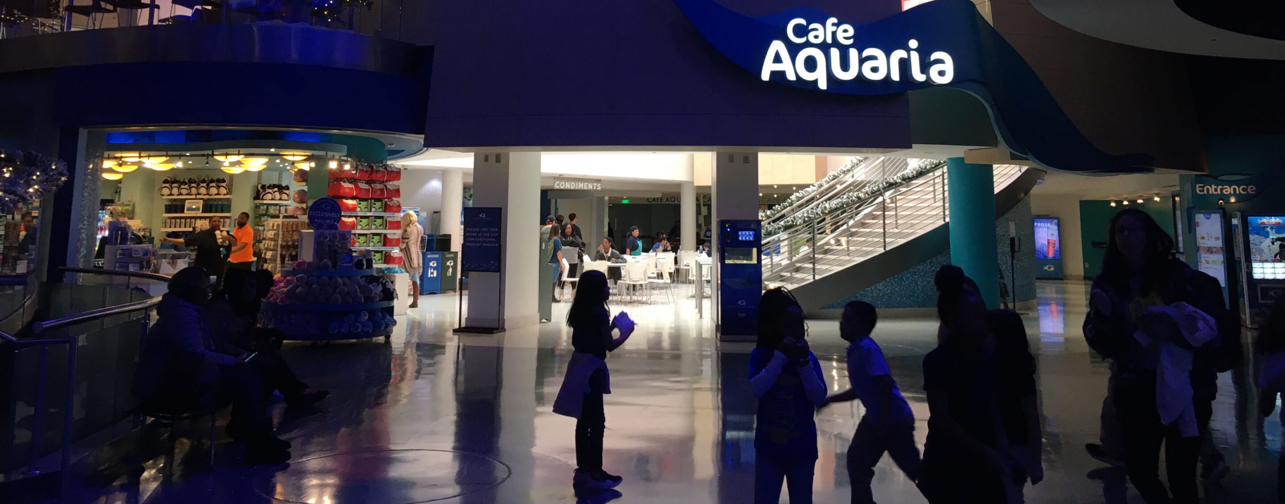
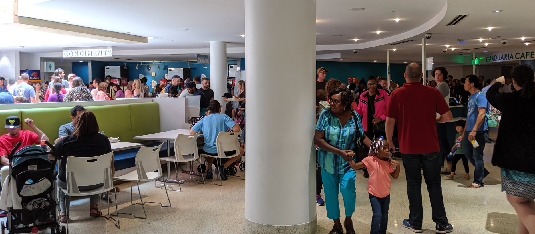
Café Aquaria is an important part of The Georgia Aquarium visitor experience- it is a place to eat, relax and recharge. Sales and attendance have dramatically increased in the last 4 years, leading to issues of overcrowding at the café. In this 16 week class project, our 5 person team was tasked with coming up with routes to help alleviate this problem, culminating in the design of an initial prototype.
How do you tackle overcrowding at the main eatery of one of the most visited Aquariums in America?
Café Aquaria is an important part of The Georgia Aquarium visitor experience- it is a place to eat, relax and recharge. Sales and attendance have dramatically increased in the last 4 years, leading to issues of overcrowding at the café. In this 16 week class project, our team was tasked to come up with routes to help alleviate this problem, culminating in the design of an initial prototype. I was in charge of handling client facing interactions, designing and conducting user needs research and formative evaluations, as well as funneling insights into the final design.
Long lines lead to exasperated customers
Long lines lead to exasperated customers
Long lines lead to exasperated customers
Long lines lead to exasperated customers
Long lines lead to exasperated customers
THE SOLUTION
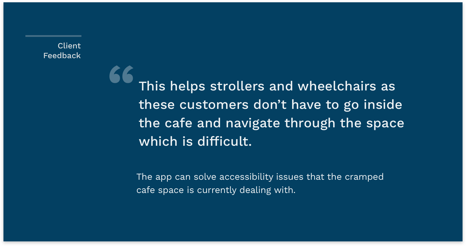
A preorder application helps customers make decisions outside the Café easing the stress and anxiety of the current ordering experience.
THE SOLUTION
A preorder application helps customers make decisions outside the Café easing the stress and anxiety of the current ordering experience.
THE SOLUTION
A preorder application helps customers make decisions outside the Café easing the stress and anxiety of the current ordering experience.
THE SOLUTION
A preorder application helps customers make decisions outside the Café easing the stress and anxiety of the current ordering experience.
THE SOLUTION
A preorder application helps customers make decisions outside the Café easing the stress and anxiety of the current ordering experience.
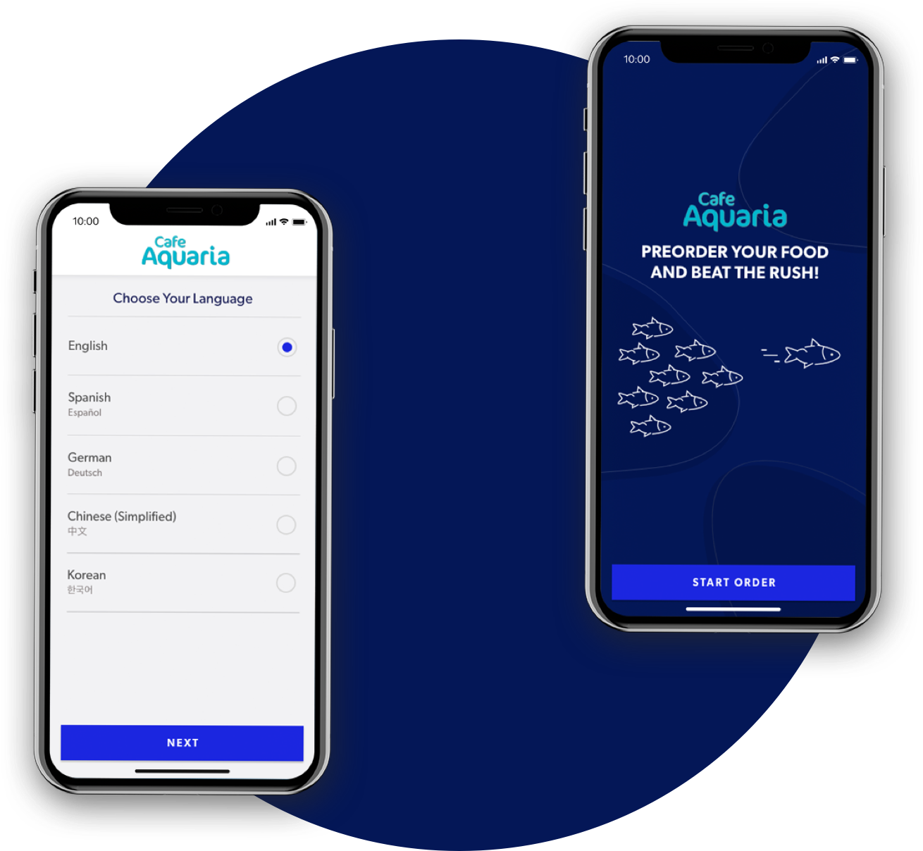
Quick and easy access for busy customers
Visitors may only go to the aquarium once and won't want to download an app just for one use. The solution we propose is a progressive web app, combining the convenience of a mobile app through the accessibility of a QR code. The onaboarding is minimal and takes the customer straight to what they need- the food.
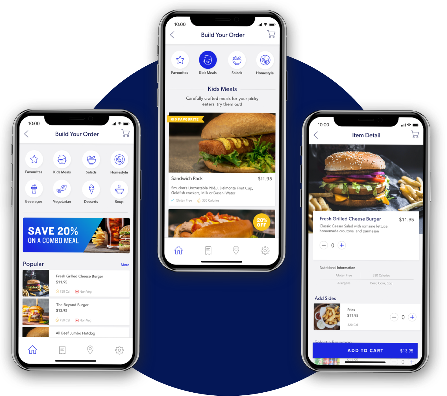
Food categorized according to customer wants and needs
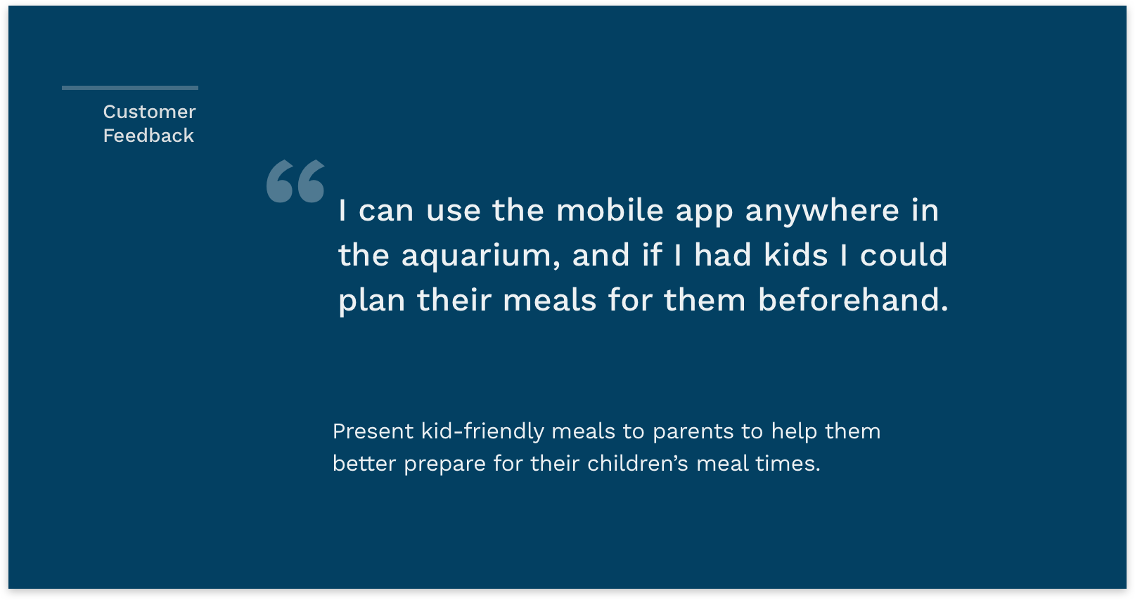
Popular food and combo meal deals are highlighted on the homepage helping customers make their decisions about what to order. A specially curated 'Kids Meal' category is particularly useful for parents with picky eaters. Nutritional information and allergens are two areas customers voiced needing, which is present for each food item.
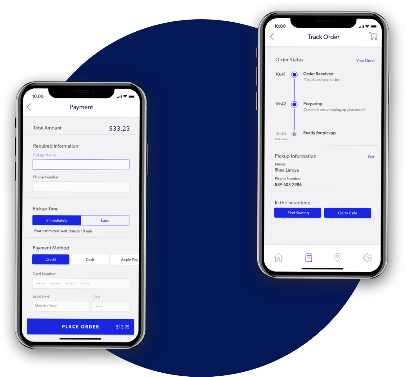
Plan ahead, set times for pickup and track orders
Customers can set pickup times within a two hour window so that they can plan ahead for their meal. Notifications are sent to a customers phone through their mobile number giving them the time to find seating while they wait for their order.
MY ROLE
I was in charge of handling client facing interactions, designing and conducting user needs research and formative evaluations, as well as funneling insights into the final design. I also designed the final prototype screens that you see in this project based on the results we gathered from usability testing with cafe customers.
PROJECT ROADMAP [15 weeks]
PROJECT ROADMAP [15 weeks]
PROJECT ROADMAP [15 weeks]
PROJECT ROADMAP [13 months]
PROJECT ROADMAP [13 months]
A double diamond design process grounded in research
A double diamond design process grounded in research
A double diamond design process grounded in research
From foundational discovery to proof-of-concept prototype
From foundational discovery to proof-of-concept prototype

USER NEEDS RESEARCH
USER NEEDS RESEARCH
USER NEEDS RESEARCH
USER NEEDS RESEARCH
USER NEEDS RESEARCH
Employing research goals and methods that facilitate a deep dive into customer and staff behavior
Employing research goals and methods that facilitate a deep dive into customer and staff behavior
Employing research goals and methods that facilitate a deep dive into customer and staff behavior
Employing research goals and methods that facilitate a deep dive into customer and staff behavior
Employing research goals and methods that facilitate a deep dive into customer and staff behavior
Data Review
Data Review
Data Review
Data Review
Data Review
Observation
Observation
Observation
Observation
Observation
Interviews
Interviews
Interviews
Interviews
Interviews
Competitor Analysis
Competitor Analysis
Competitor Analysis
Competitor Analysis
Competitor Analysis
What are the main user profiles of our customers?
What are the main user profiles of our customers?
What are the main user profiles of our customers?
What are the main user profiles of our customers?
What are the main user profiles of our customers?
What does the user journey for customers at the café look like?- including their pain points and motivations?
What does the user journey for customers at the café look like?- including their pain points and motivations?
What does the user journey for customers at the café look like?- including their pain points and motivations?
What does the user journey for customers at the café look like?- including their pain points and motivations?
What does the user journey for customers at the café look like?- including their pain points and motivations?
Does the customers mental model of how the cafe works match up to the reality of the process?
Does the customers mental model of how the cafe works match up to the reality of the process?
Does the customers mental model of how the cafe works match up to the reality of the process?
Does the customers mental model of how the cafe works match up to the reality of the process?
Does the customers mental model of how the cafe works match up to the reality of the process?
What are the customers’ physical, cognitive, and communication tasks at the cafe?
What are the customers’ physical, cognitive, and communication tasks at the cafe?
What are the customers’ physical, cognitive, and communication tasks at the cafe?
What are the customers’ physical, cognitive, and communication tasks at the cafe?
What are the customers’ physical, cognitive, and communication tasks at the cafe?
What is the impact of the “back of house” and “front of house” staff on customer experience?
What is the impact of the “back of house” and “front of house” staff on customer experience?
What is the impact of the “back of house” and “front of house” staff on customer experience?
What is the impact of the “back of house” and “front of house” staff on customer experience?
What is the impact of the “back of house” and “front of house” staff on customer experience?
Do customer and staff behaviors change between high traffic and low traffic periods?
Do customer and staff behaviors change between high traffic and low traffic periods?
Do customer and staff behaviors change between high traffic and low traffic periods?
Do customer and staff behaviors change between high traffic and low traffic periods?
Do customer and staff behaviors change between high traffic and low traffic periods?
DATA REVIEW
DATA REVIEW
DATA REVIEW
DATA REVIEW
DATA REVIEW
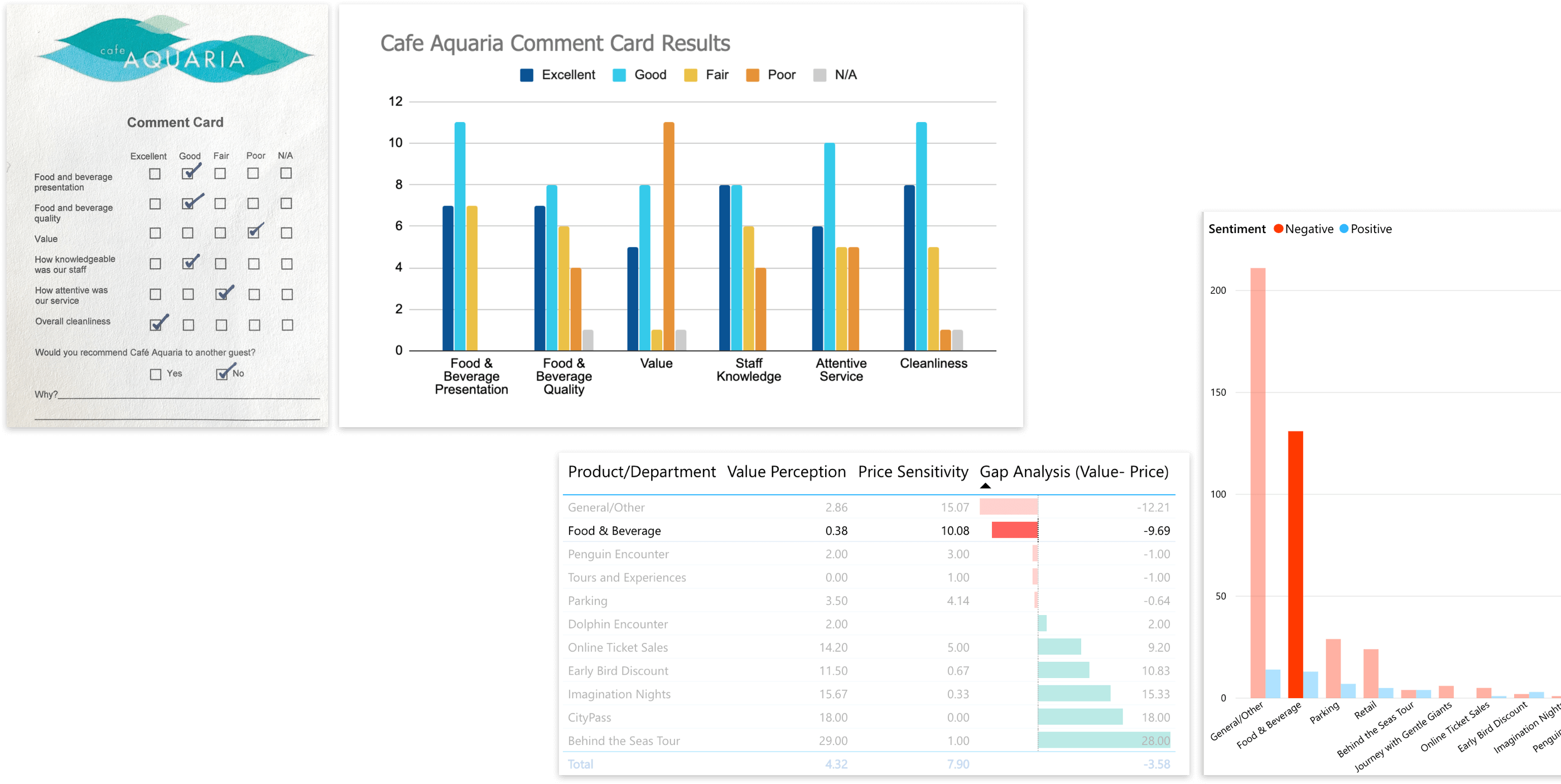
The cafe gets poorer ratings and feedback than the aquarium as a whole due to long wait times and over priced food
We combed through data from TatVam, a customer experience management tool to understand customer sentiment through online reviews. The aquarium's business intelligence platform, Power BI, revealed that the perceived value of food & beverage is the lowest amongst all of the services and amenities provided by the aqaurium.
RESOURCES
Tatvam
Power BI
Comment Cards
Online Reviews
RESOURCES
Tatvam
Power BI
Comment Cards
Online Reviews
RESOURCES
Tatvam
Power BI
Comment Cards
Online Reviews
RESOURCES
Tatvam
Power BI
Comment Cards
Online Reviews
RESOURCES
Tatvam
Power BI
Comment Cards
Online Reviews
ONLINE REVIEWER
“Your facility has no idea how to handle crowds. Cafe Aquaria is total chaos with no traffic flow. It’s Awful! and the price gouging is just too greedy."
OBSERVATION
OBSERVATION
OBSERVATION
OBSERVATION
OBSERVATION
Observations conducted at the cafe revealed how different the customer and staff experience can be between high and low traffic periods
We split our team based on the four separate spaces inside the cafe- ordering, cashier, outer seating, and upper seating to understand the customer journey from start to end. Observations helped us come up with conclusions and assumptions that were later confirmed by in-person interviews with customers and staff members.
DETAILS
5 observers
4 spaces
2 hrs/observer
DETAILS
5 observers
4 spaces
2 hrs/observer
DETAILS
5 observers
4 spaces
2 hrs/observer
DETAILS
5 observers
4 spaces
2 hrs/observer
DETAILS
5 observers
4 spaces
2 hrs/observer
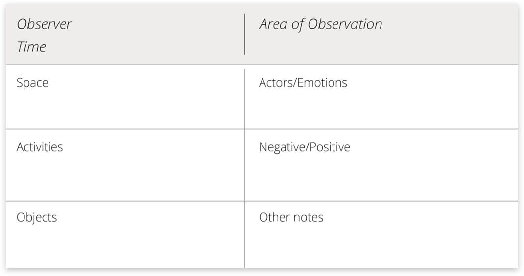
Observational template
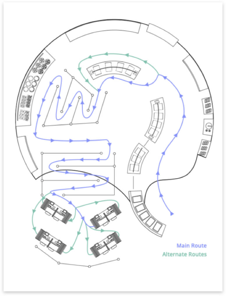
Mapping routes of customer movement
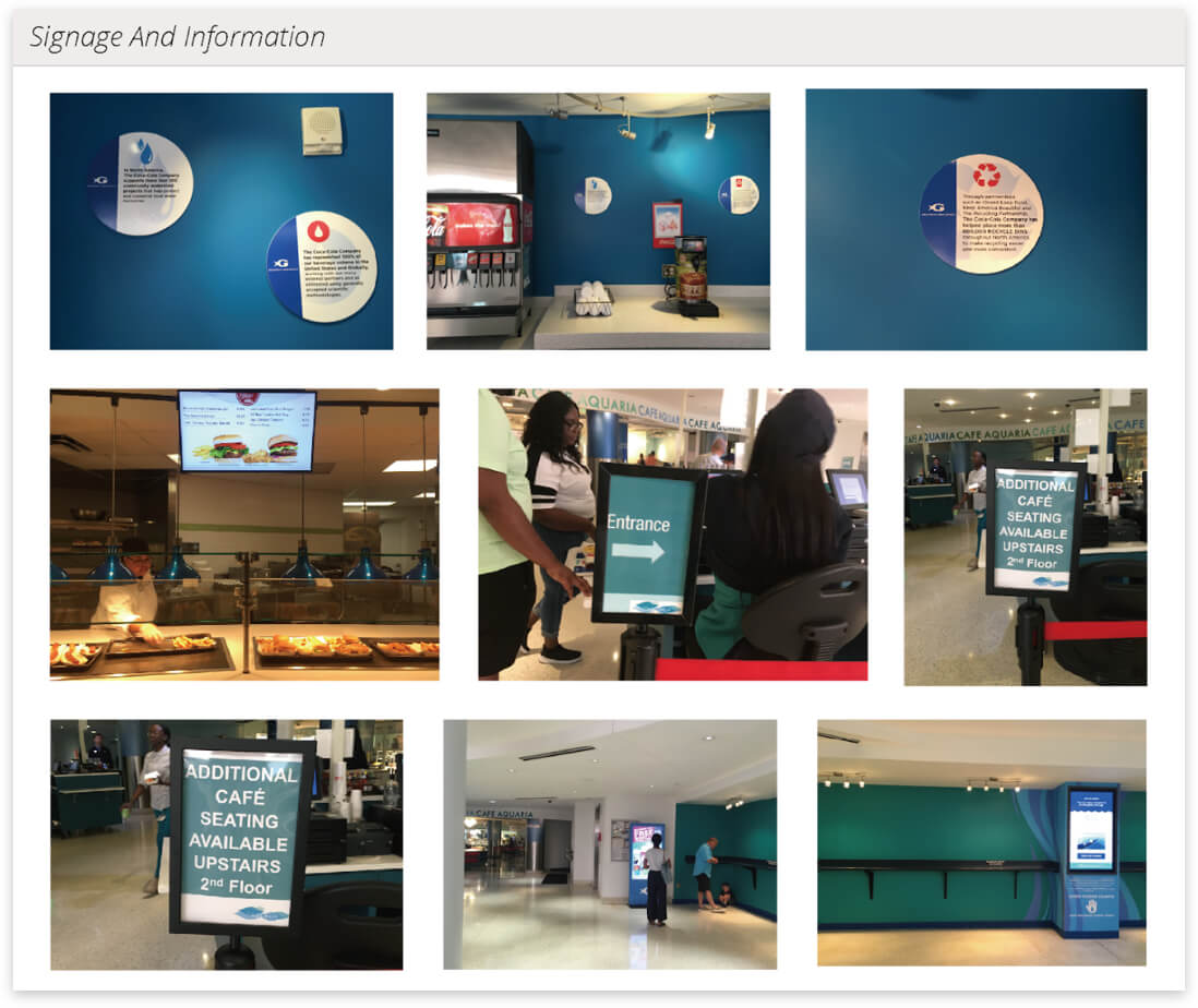
Grouping observations thematically
03. INTERVIEWS
03. INTERVIEWS
03. INTERVIEWS
03. INTERVIEWS
03. INTERVIEWS
Touring interviews (a combination of shadowing and discussion) led to rich findings that intercept interviews fell short of
To gain insights into customer motivations and behavior, we first used intercept interviews. Having customers retrospectively think about their actions did not produce much valuable data, and it was difficult to recruit participants. We realized that touring interviews with customers conducted in a format similar to a contextual inquiry could surface stronger insights.
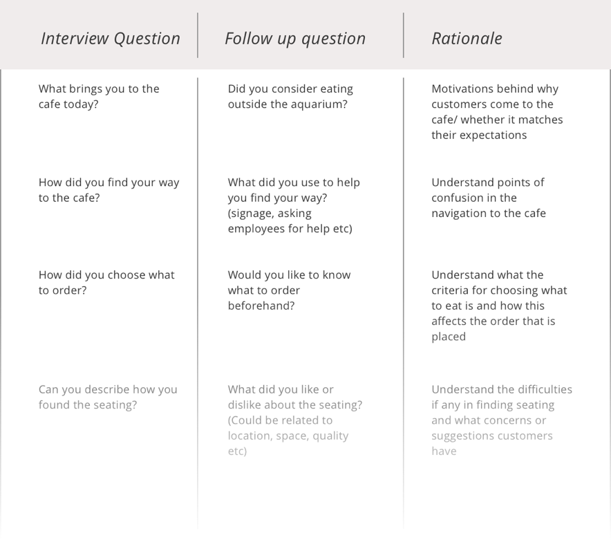
I created explicit interview guides with question rationales for both staff and customers
04.COMPETITOR ANALYSIS
04.COMPETITOR ANALYSIS
04.COMPETITOR ANALYSIS
04.COMPETITOR ANALYSIS
04.COMPETITOR ANALYSIS
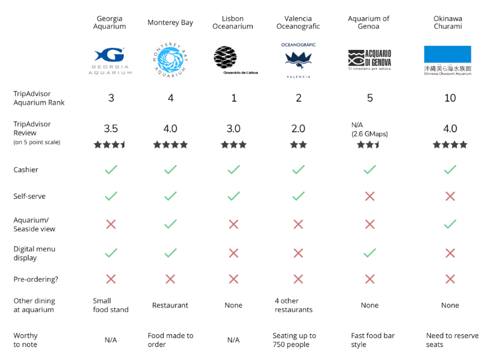
Highly rated eateries at similar aquariums have oceanic views and average food; customer experience is influenced by a novel ambience
Highly rated eateries at similar aquariums have oceanic views and average food; customer experience is influenced by a novel ambience
Highly rated eateries at similar aquariums have oceanic views and average food; customer experience is influenced by a novel ambience
Highly rated eateries at similar aquariums have oceanic views and average food; customer experience is influenced by a novel ambience
Highly rated eateries at similar aquariums have oceanic views and average food; customer experience is influenced by a novel ambience
RESEARCH SYNTHESIS
RESEARCH SYNTHESIS
RESEARCH SYNTHESIS
RESEARCH SYNTHESIS
RESEARCH SYNTHESIS
Mapping affinities between the data gathered to derive insights
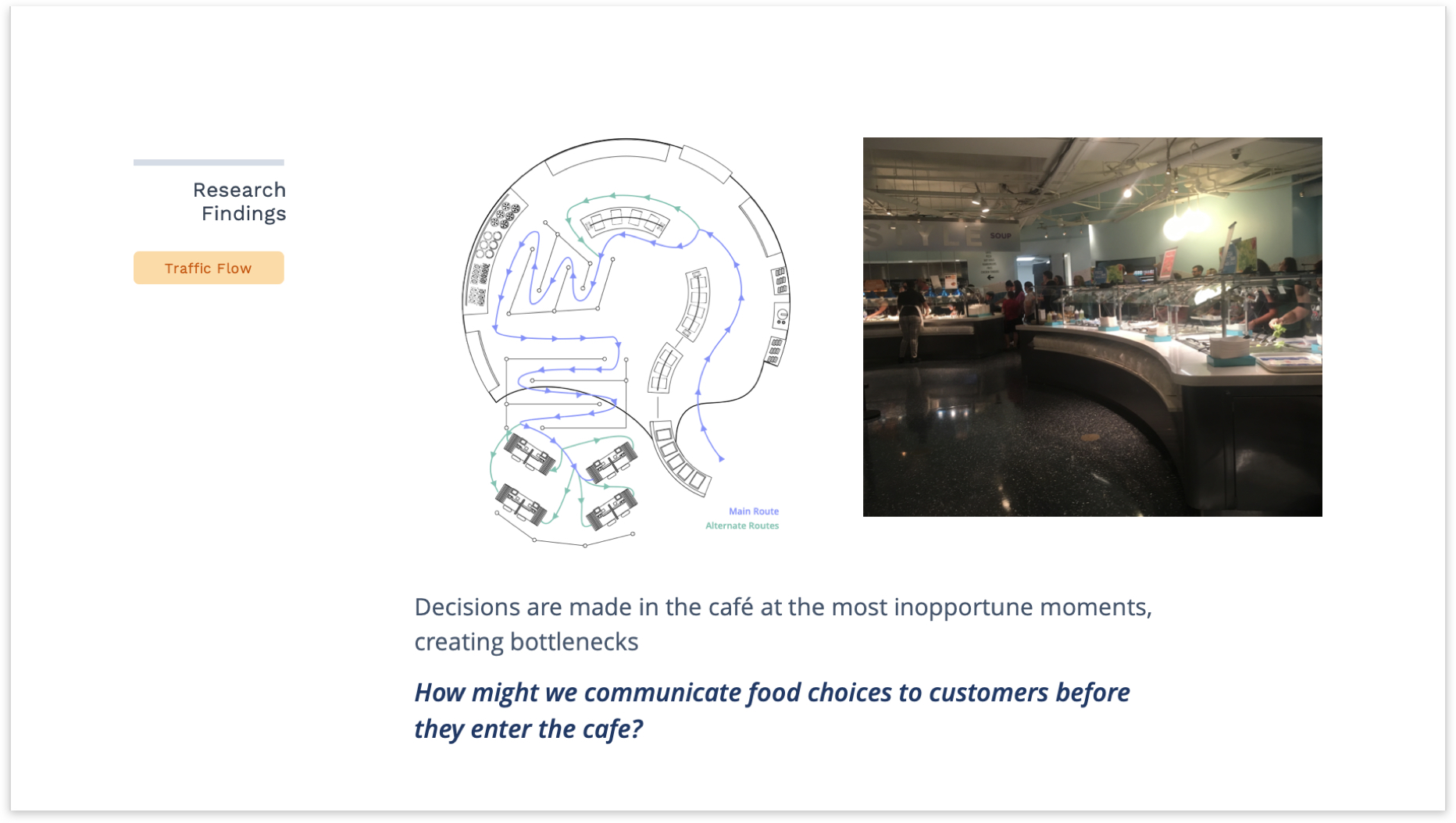
After synthesizing our observations, interviews, secondary research, and creating an affinity map, our research findings can be broken down into five main areas:
- Customer Motivations
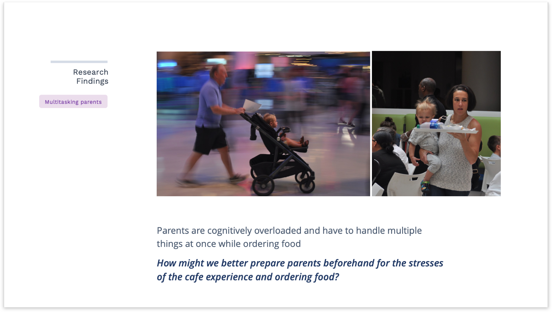
- Multitasking Parents
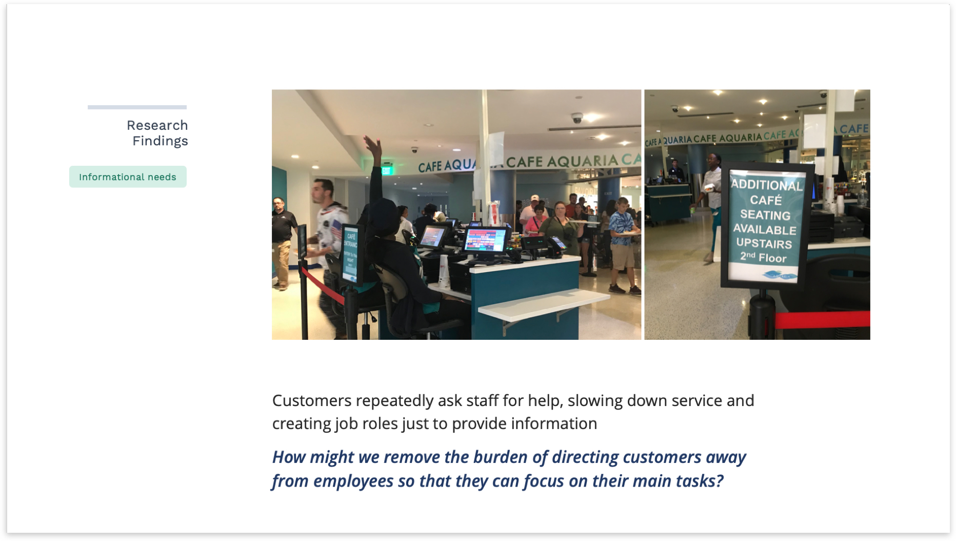
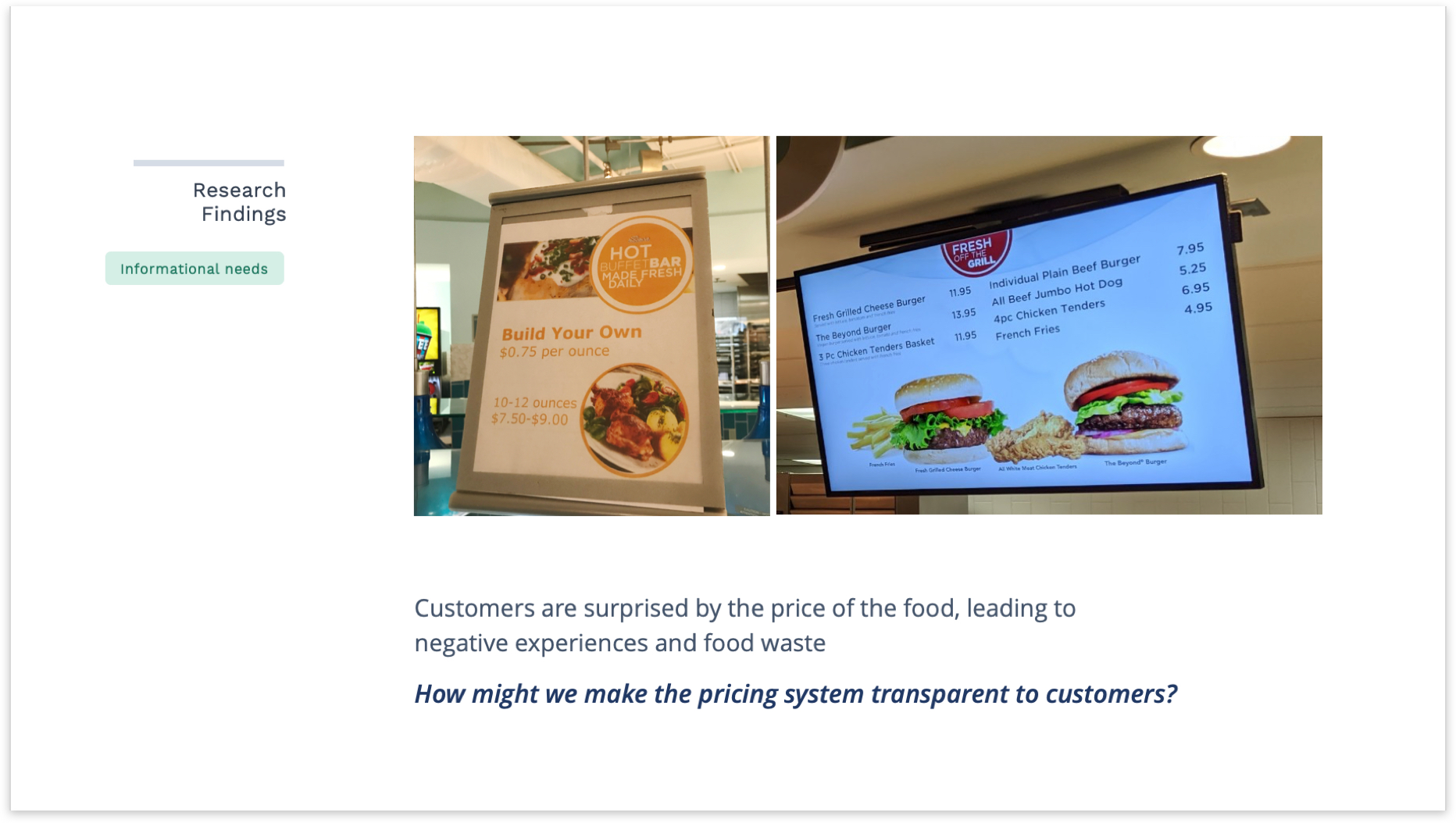
- Informational Needs
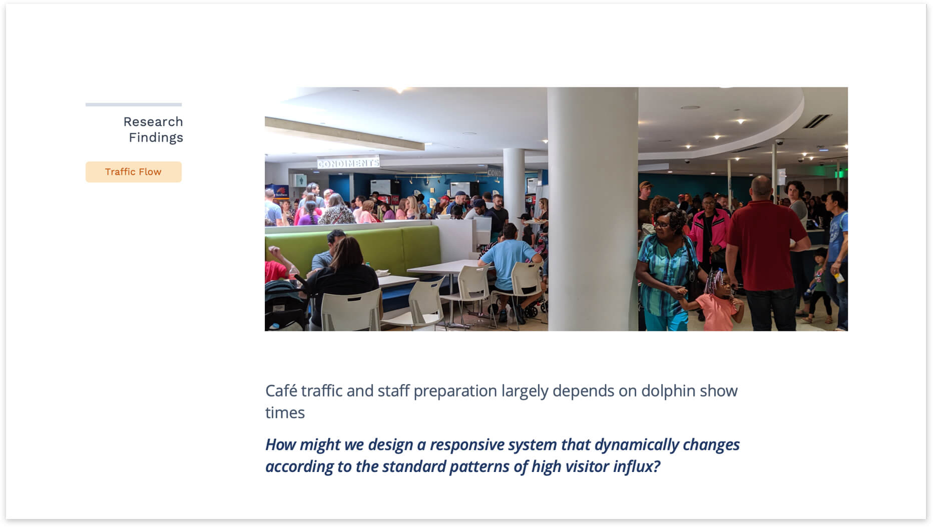
- Flow of Traffic
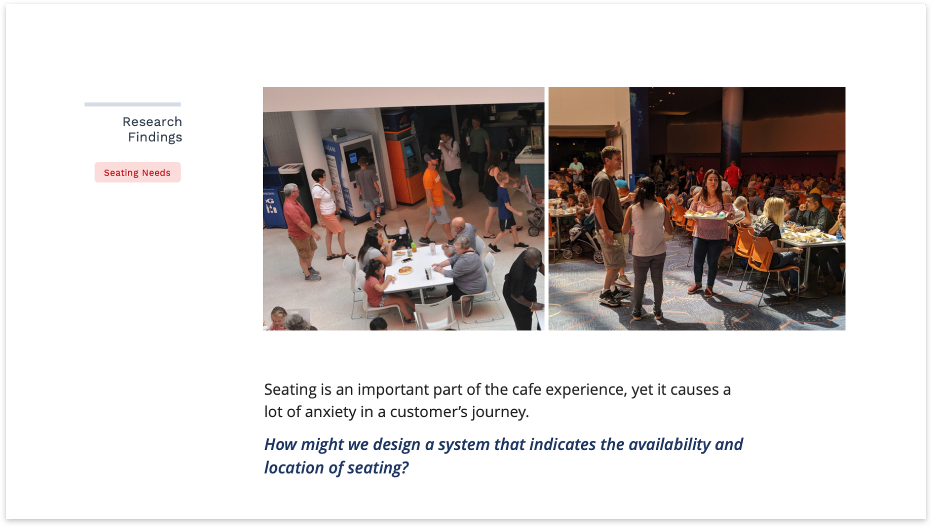
- Seating Needs

Using the research findings to develop 'how might we statements' that can guide concept development
IDENTIFYING OUR USERS
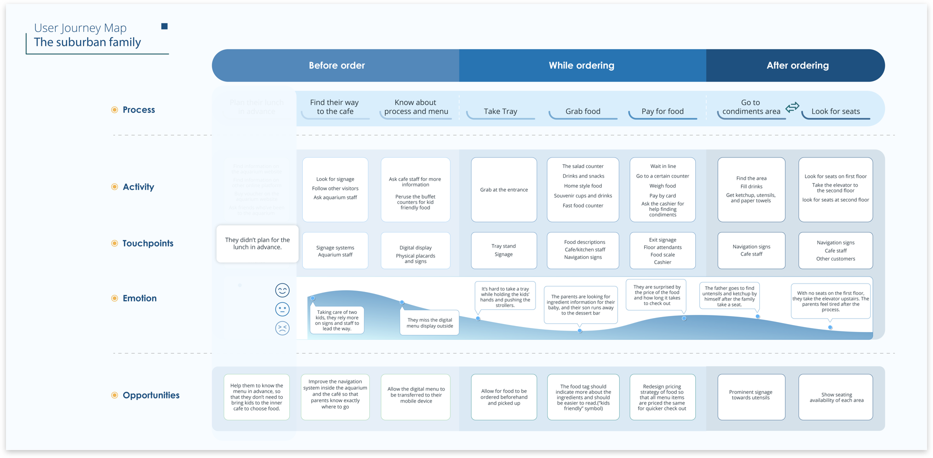
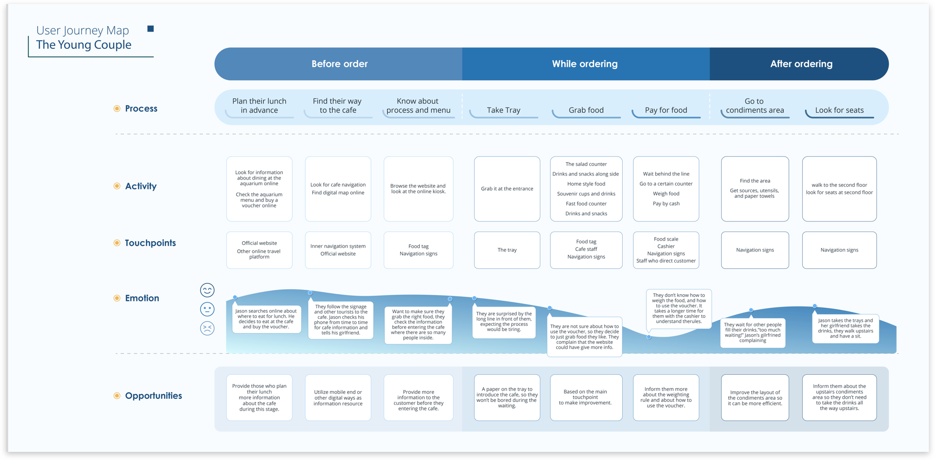
Creating personas, empathy maps and user journeys based on key customer profiles –
IDENTIFYING OUR USERS
Creating personas, empathy maps and user journeys based on key customer profiles –
IDENTIFYING OUR USERS
Creating personas, empathy maps and user journeys based on key customer profiles –
IDENTIFYING OUR USERS
Creating personas, empathy maps and user journeys based on key customer profiles –
IDENTIFYING OUR USERS
Creating personas, empathy maps and user journeys based on key customer profiles –

The Suburban Family
The Suburban Family
The Suburban Family
The Suburban Family
The Suburban Family

The Elderly
The Elderly
The Elderly
The Elderly
The Elderly

The Couple
The Couple
The Couple
The Couple
The Couple
Ideation and design process

Brainstorming divergent designs that to make the customer ordering experience more enjoyable
OPTION 1
OPTION 1
OPTION 1
DIVERGENT DESIGN THINKING
USABILITY TESTING
Pre-order kiosk
Pre-order kiosk
Pre-order Kiosk
Testing designs with the client to see which one sticks
Testing the prototype in Uttar Pradesh, India
I tested the new iteration of the app in five communities in Uttar Pradesh with our key filmmakers mini grid administrators and customers. I designed a field guide for testing that probed into the overall usability, content, and general interest in the app, and used task based usability testing. We implemented changes over a two week period while on the field based on our observations. Participants relied extensively on the local grid administrators for help, trusting their input and coming up with responses to the questions with them. We found that building a rapport with this last-mile energy service staff would be crucial for the success of the project.
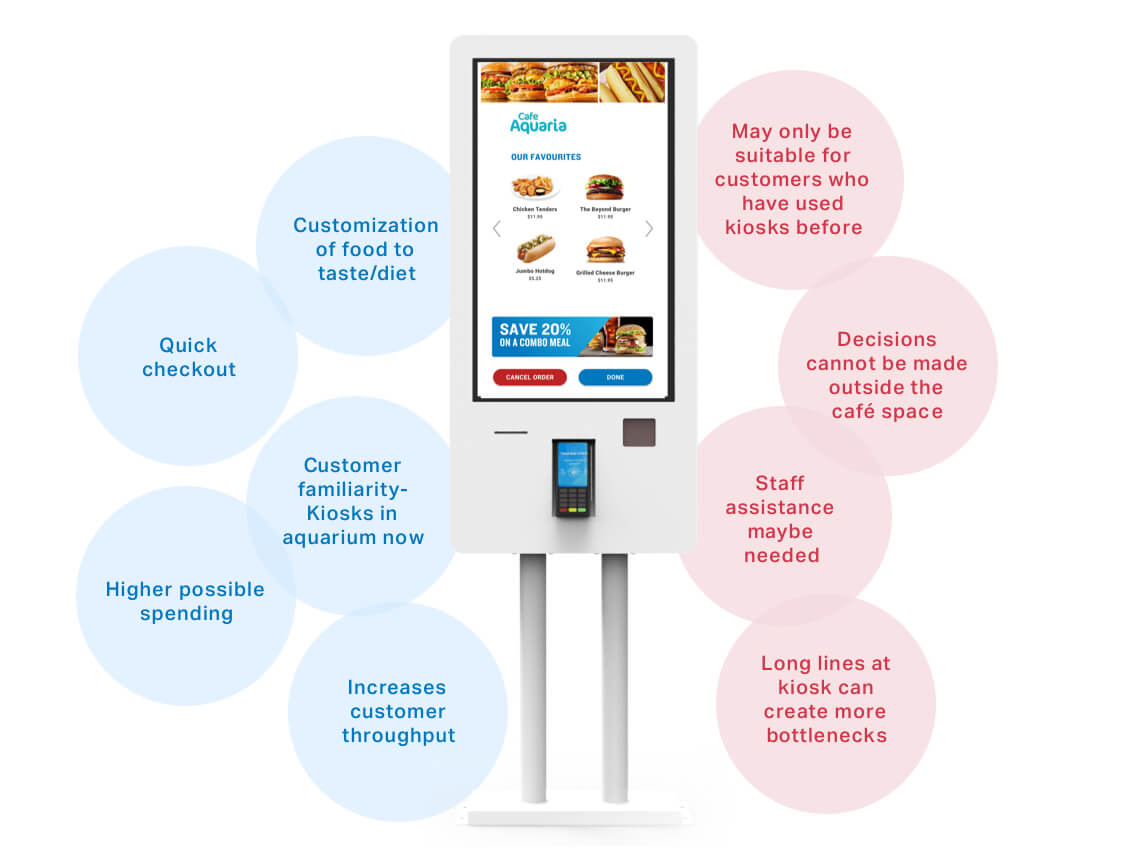
Self-ordering kiosks can increase customer throughput and sales by offering visitors another way to pay for their purchases at the cafe. Research has shown that customers spend 20% more at kiosks because customers are more comfortable ordering alone. There is the possibility that long lines could form at the kiosks and pick up counters, increasing wait times. Customers would still need assistance in using the system which requires intervention by staff members. This would necessitate the development of a new job role for this specific purpose or tweaking of an existing role.
Self-ordering kiosks can increase customer throughput and sales by offering visitors another way to pay for their purchases at the cafe. Research has shown that customers spend 20% more at kiosks because customers are more comfortable ordering alone. There is the possibility that long lines could form at the kiosks and pick up counters, increasing wait times. Customers would still need assistance in using the system which requires intervention by staff members. This would necessitate the development of a new job role for this specific purpose or tweaking of an existing role.
Self-ordering kiosks can increase customer throughput and sales by offering visitors another way to pay for their purchases at the cafe. Research has shown that customers spend 20% more at kiosks because customers are more comfortable ordering alone. There is the possibility that long lines could form at the kiosks and pick up counters, increasing wait times. Customers would still need assistance in using the system which requires intervention by staff members. This would necessitate the development of a new job role for this specific purpose or tweaking of an existing role.
As part of the design process, we brainstormed three different design solutions.
Mini grids are small scale power grids that improve access to electricity in developing countries. According to a recent World Bank Study, they have the potential to bring electricity to half a billion people and tackle the universal energy gap. In rural India, mini grids provide reliable sources of electricity to consumers and businesses who struggle with access to the main grid and frequent power cuts. Still, Energy Service Companies(ESCO’s) need to build trust with potential customers who are wary of privatized energy services. I joined the Quicksand team as a user experience designer to prototype a type a proof-of-concept community engagement solution that could scale up the use of mini grids.
OPTION 2
OPTION 2
OPTION 2
DIVERGENT DESIGN THINKING
USABILITY TESTING
Pre-order mobile application
Pre-order mobile application
Pre-order mobile application
Testing designs with the client to see which one sticks
Testing the prototype in Uttar Pradesh, India
I tested the new iteration of the app in five communities in Uttar Pradesh with our key filmmakers mini grid administrators and customers. I designed a field guide for testing that probed into the overall usability, content, and general interest in the app, and used task based usability testing. We implemented changes over a two week period while on the field based on our observations. Participants relied extensively on the local grid administrators for help, trusting their input and coming up with responses to the questions with them. We found that building a rapport with this last-mile energy service staff would be crucial for the success of the project.
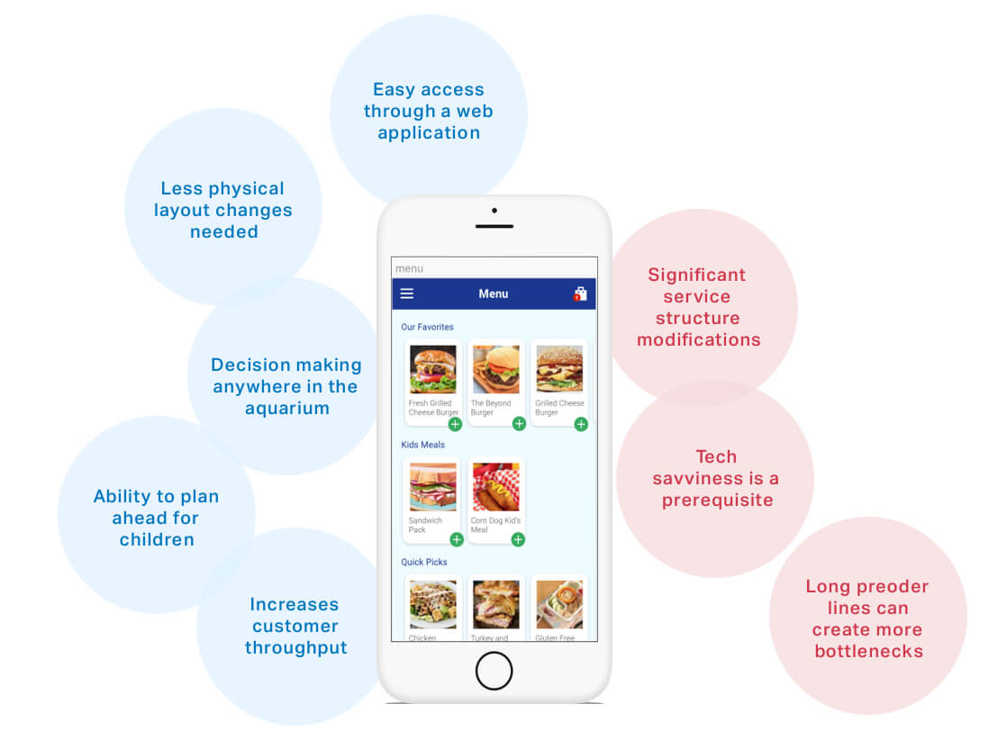
Our second concept explores the pre-order system in a mobile format. The application will largely only be used once, so a web application accessible by QR code or a link is ideal. If the app becomes popular then it is possible that speed and service will slow down, which was the case with Starbucks’ mobile pre-order app. This will require significant changes to the service structure and café layout.
Our second concept explores the pre-order system in a mobile format. The application will largely only be used once, so a web application accessible by QR code or a link is ideal. If the app becomes popular then it is possible that speed and service will slow down, which was the case with Starbucks’ mobile pre-order app. This will require significant changes to the service structure and café layout.
Our second concept explores the pre-order system in a mobile format. The application will largely only be used once, so a web application accessible by QR code or a link is ideal. If the app becomes popular then it is possible that speed and service will slow down, which was the case with Starbucks’ mobile pre-order app. This will require significant changes to the service structure and café layout.
As part of the design process, we brainstormed three different design solutions.
Mini grids are small scale power grids that improve access to electricity in developing countries. According to a recent World Bank Study, they have the potential to bring electricity to half a billion people and tackle the universal energy gap. In rural India, mini grids provide reliable sources of electricity to consumers and businesses who struggle with access to the main grid and frequent power cuts. Still, Energy Service Companies(ESCO’s) need to build trust with potential customers who are wary of privatized energy services. I joined the Quicksand team as a user experience designer to prototype a type a proof-of-concept community engagement solution that could scale up the use of mini grids.
OPTION 3
OPTION 3
OPTION 3
DIVERGENT DESIGN THINKING
USABILITY TESTING
Interactive information display
Interactive information display
Interactive information Display
Testing designs with the client to see which one sticks
Testing the prototype in Uttar Pradesh, India
I tested the new iteration of the app in five communities in Uttar Pradesh with our key filmmakers mini grid administrators and customers. I designed a field guide for testing that probed into the overall usability, content, and general interest in the app, and used task based usability testing. We implemented changes over a two week period while on the field based on our observations. Participants relied extensively on the local grid administrators for help, trusting their input and coming up with responses to the questions with them. We found that building a rapport with this last-mile energy service staff would be crucial for the success of the project.
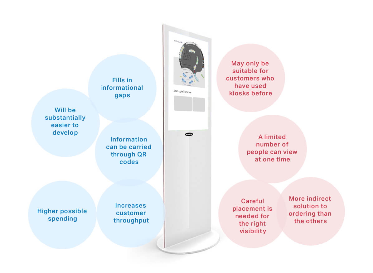
The research we conducted in the previous phase revealed that customers do not have the information they need to make well informed decisions. Currently there is an interactive digital display that is placed outside the cafe entrance which has the opportunity for a redesign:
- Making the pricing system more transparent so that customers spend less time at the check-out area.
- Communicating the food choices to customers before they enter the cafe reducing dwell times at each station.
- Displaying the location of important places like the condiments and seating areas to give customers a mental model of the cafe layout before they enter the space.
As part of the design process, we brainstormed three different design solutions.
Mini grids are small scale power grids that improve access to electricity in developing countries. According to a recent World Bank Study, they have the potential to bring electricity to half a billion people and tackle the universal energy gap. In rural India, mini grids provide reliable sources of electricity to consumers and businesses who struggle with access to the main grid and frequent power cuts. Still, Energy Service Companies(ESCO’s) need to build trust with potential customers who are wary of privatized energy services. I joined the Quicksand team as a user experience designer to prototype a type a proof-of-concept community engagement solution that could scale up the use of mini grids.
SOLUTION FEEDBACK SESSIONS
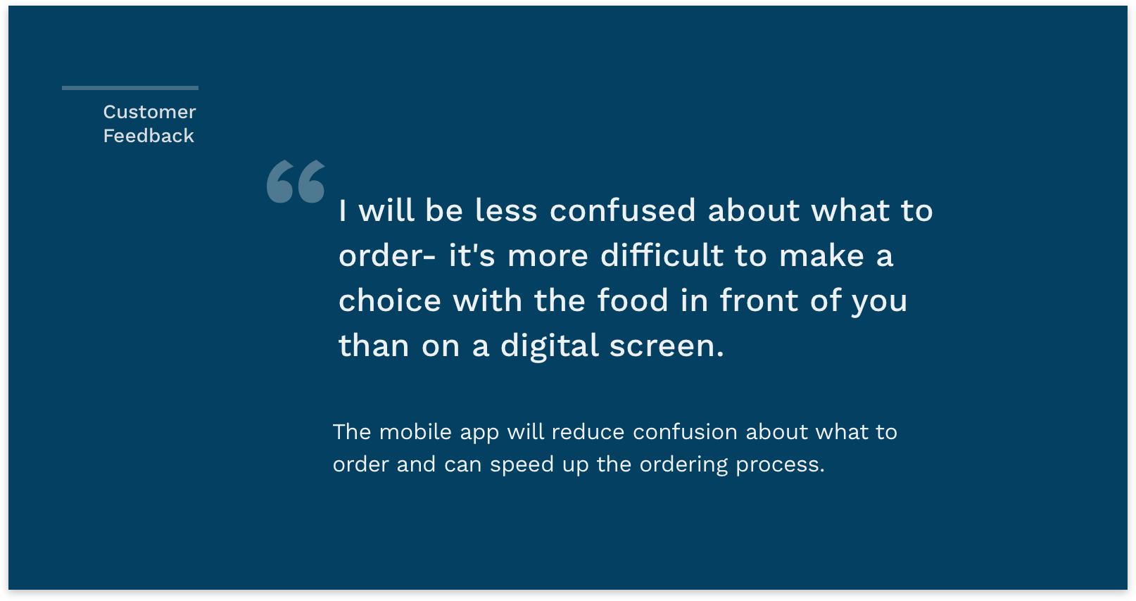
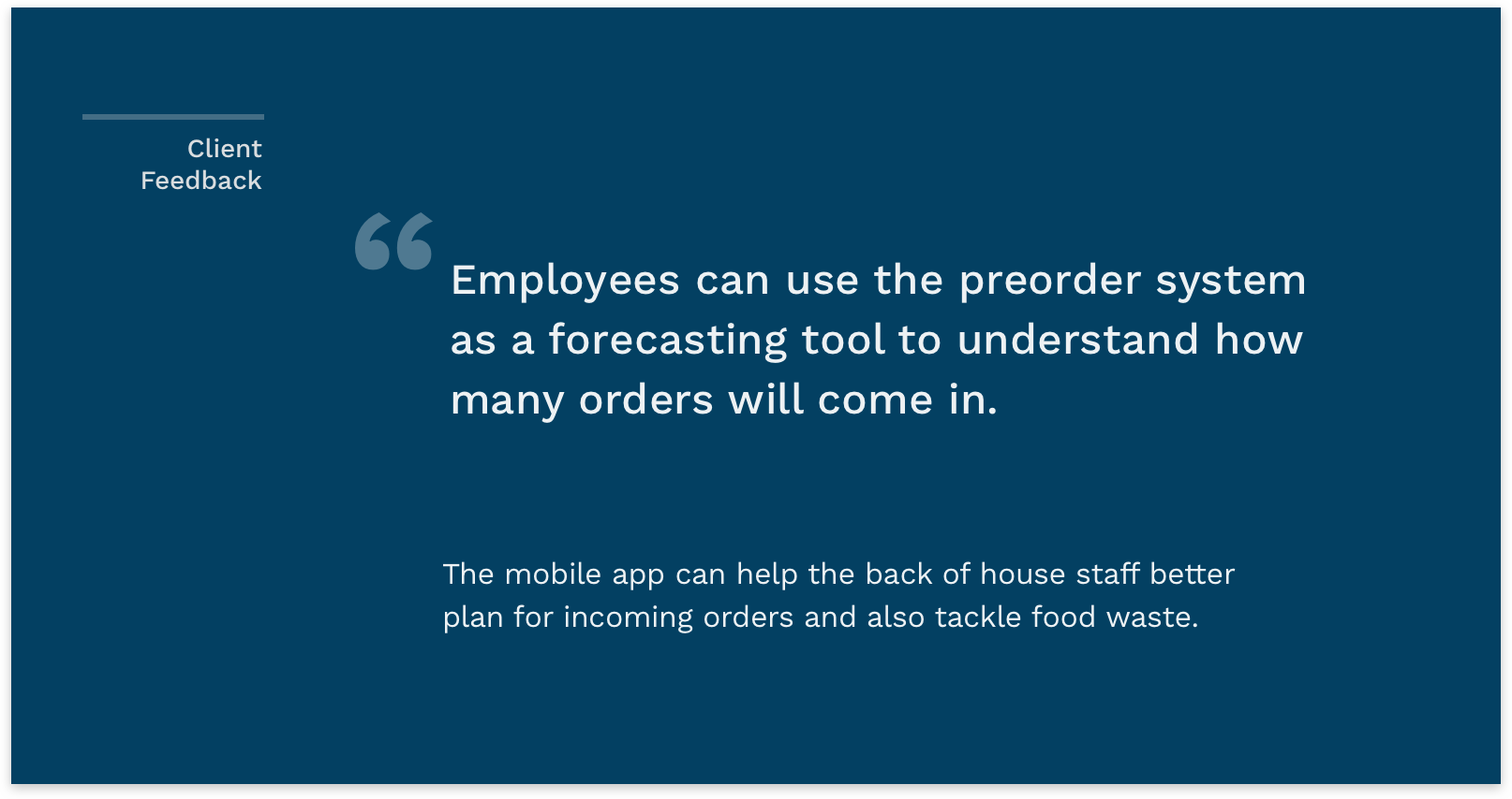
The preorder mobile application received the most positive feedback from client and customer feedback sessions
The preorder mobile application received the most positive feedback from client and customer feedback sessions
The preorder mobile application received the most positive feedback from client and customer feedback sessions
The preorder mobile application received the most positive feedback from client and customer feedback sessions
The preorder mobile application received the most positive feedback from client and customer feedback sessions
A growing number of people in rural India own smartphones but have little experience in creating content. We had to build a filmmaking app for these first time mobile users, helping them produce narrative driven films with minimal effort.
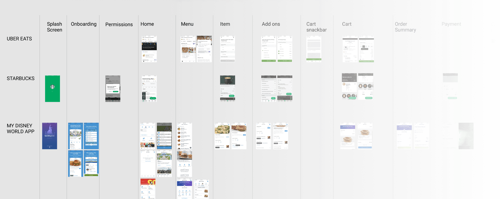
I broke down the states of comparable pre order apps to understand conventional flows
WIREFRAME DESIGN
USABILITY TESTING
USABILITY TESTING
USABILITY TESTING
USABILITY TESTING
Initial feedback on the low fidelity prototype revealed features that customers liked and features to nix
Testing the prototype in Uttar Pradesh, India
Testing the prototype in Uttar Pradesh, India
Testing the prototype in Uttar Pradesh, India
Testing the prototype in Uttar Pradesh, India
I tested the new iteration of the app in five communities in Uttar Pradesh with our key filmmakers mini grid administrators and customers. I designed a field guide for testing that probed into the overall usability, content, and general interest in the app, and used task based usability testing. We implemented changes over a two week period while on the field based on our observations. Participants relied extensively on the local grid administrators for help, trusting their input and coming up with responses to the questions with them. We found that building a rapport with this last-mile energy service staff would be crucial for the success of the project.
5 Participants
15 Participants
15 Participants
Invision Prototype
Android Prototype
Android Prototype
30 min/session
2 Weeks
2 Weeks
2 Weeks
Feature Discussion
Usability Testing
Usability Testing
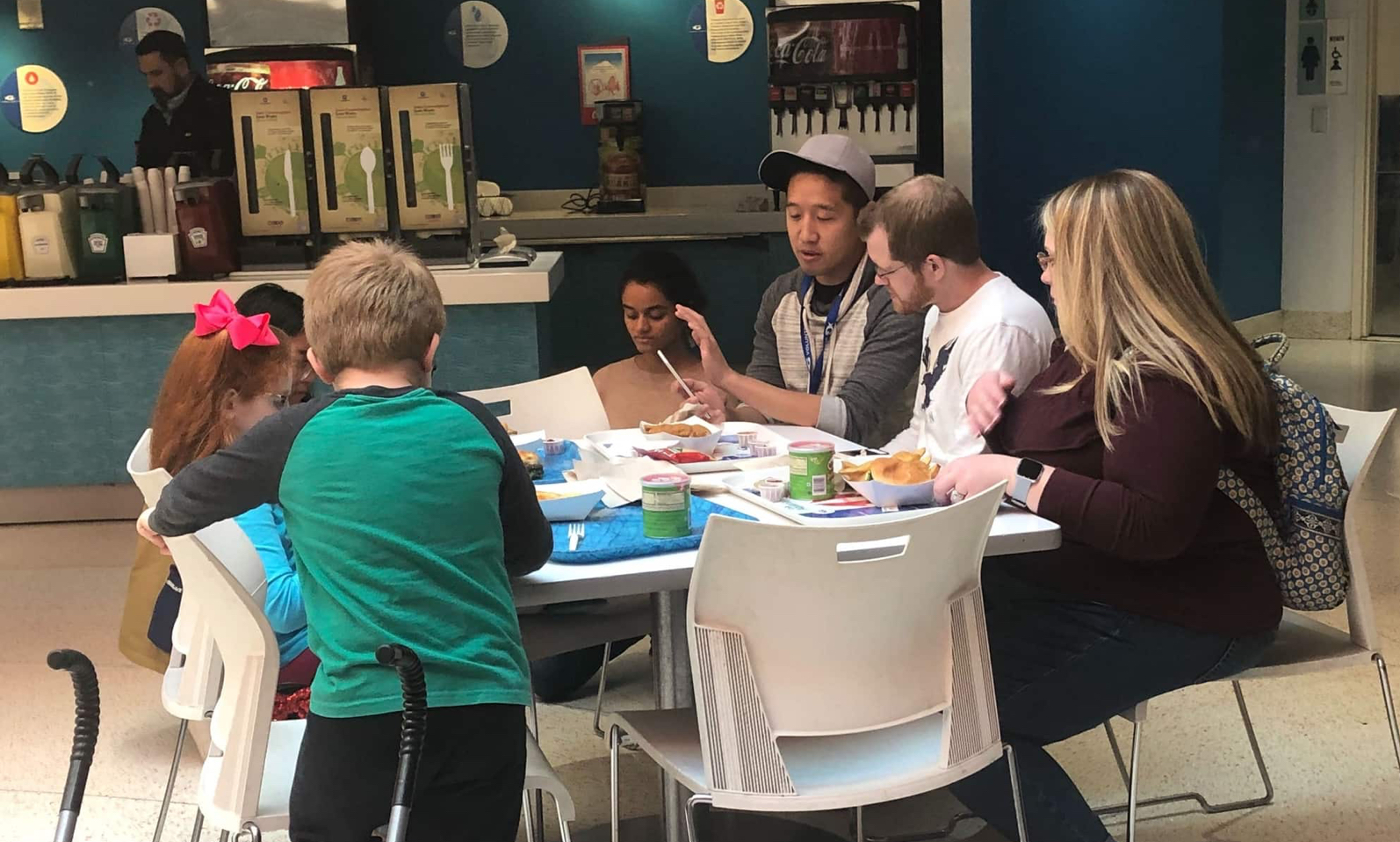
User testing a low fidelity prototype with cafe customers
After we developed a low-fidelity interactive wireframes on Sketch, we conducted five on-on-one in-person feedback sessions by showing them the wireframes and having them go through each stage of the app to gather ideas on user flow and features of the app similar to the customer feedback session in round one. The participants again were Georgia Tech students who have been to the aquarium

App Access
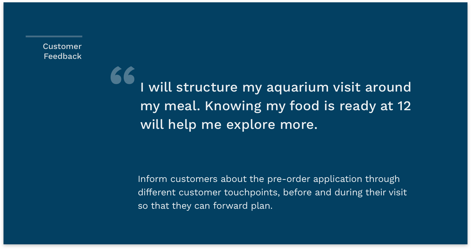
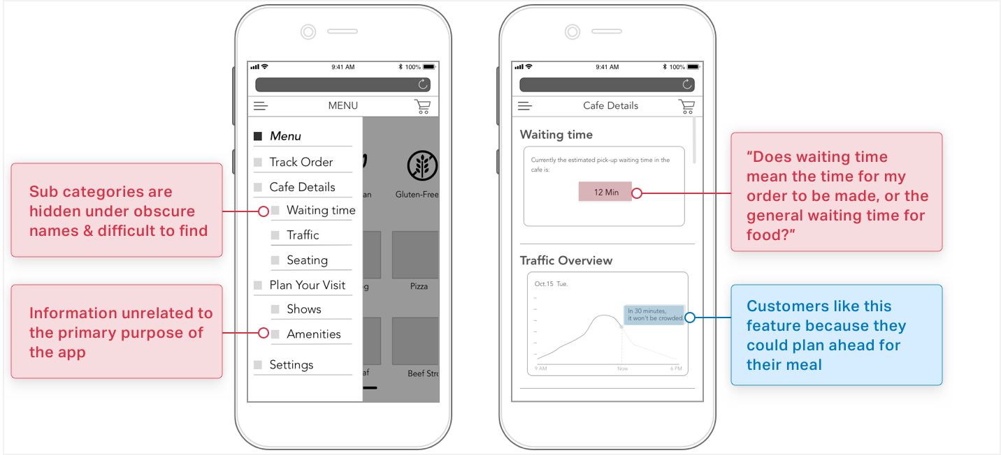
A scannable QR code placed on posters links visitors to the web app, and particpants responded well to the quick onboarding process.
Food Selection
Content needs to be reworded in the main menu, and information like extra cost and special needs dietary information needs to be added in.

Checkout
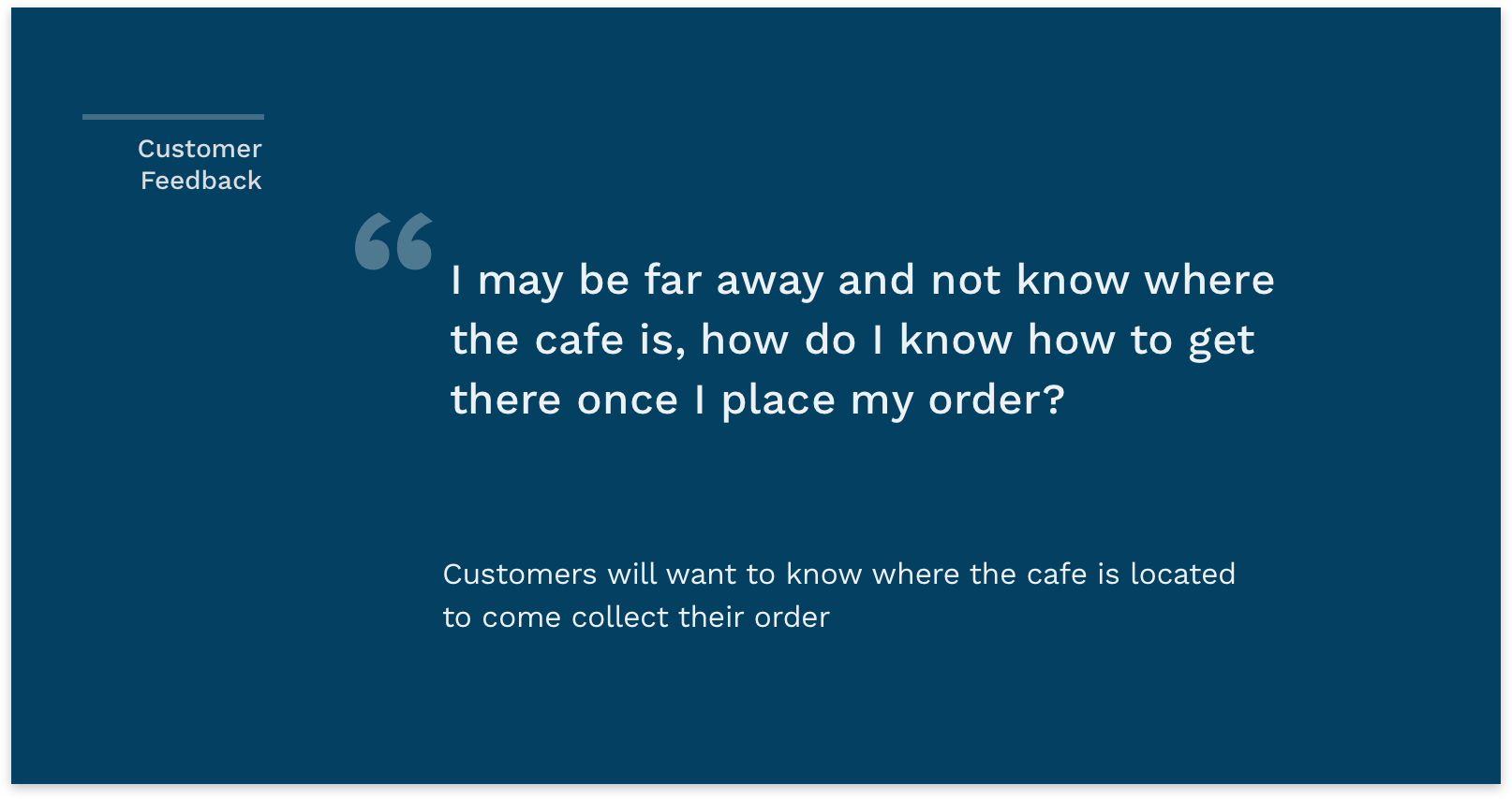
The checkout process should highlight how to get to the cafe once the order is complete.

Navigation
Confusion arose because of the information hierarchy of the menu, and what the categories meant.
EXPERT REVIEW
USABILITY TESTING
USABILITY TESTING
USABILITY TESTING
USABILITY TESTING
Expert feedback on features is important so that time and resources are concentrated on building out functionality that customers will actually use, versus putting effort into features that do not add value.
Testing the prototype in Uttar Pradesh, India
Testing the prototype in Uttar Pradesh, India
Testing the prototype in Uttar Pradesh, India
Testing the prototype in Uttar Pradesh, India
I tested the new iteration of the app in five communities in Uttar Pradesh with our key filmmakers mini grid administrators and customers. I designed a field guide for testing that probed into the overall usability, content, and general interest in the app, and used task based usability testing. We implemented changes over a two week period while on the field based on our observations. Participants relied extensively on the local grid administrators for help, trusting their input and coming up with responses to the questions with them. We found that building a rapport with this last-mile energy service staff would be crucial for the success of the project.
3 Participants
15 Participants
15 Participants
Invision Prototype
Android Prototype
Android Prototype
1 hr/session
2 Weeks
2 Weeks
2 Weeks
Think aloud usability test
Usability Testing
Usability Testing
We considered the experts in this project to be the aquarium and café management staff, who understand the operations of the café and regularly interact with customers. They have the ability to gauge feature importance and use because of their experience with the problem space. I designed the test guide linked below-
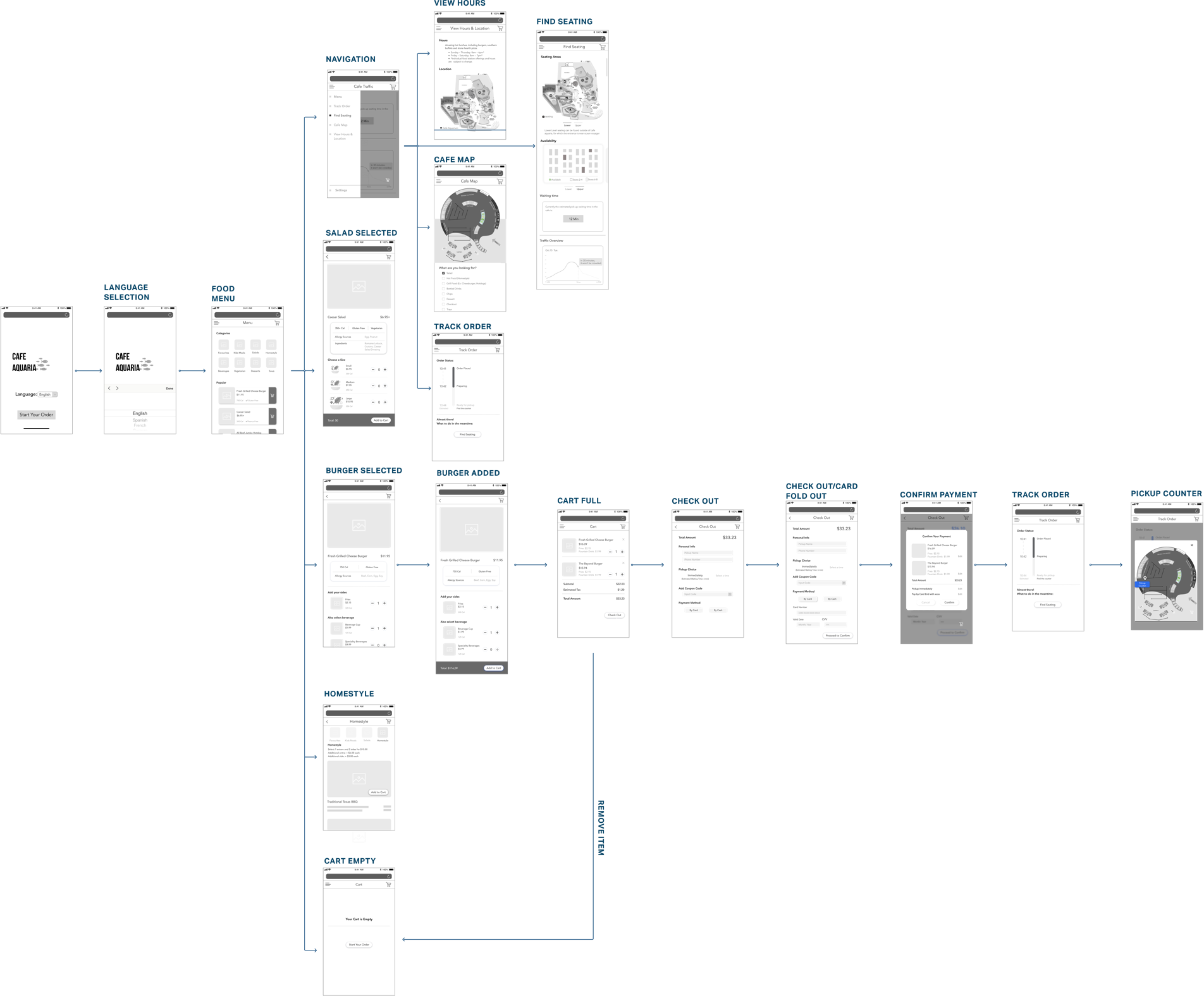
Next iteration of the app tested with experts
Interested in working together? get in touch.

